
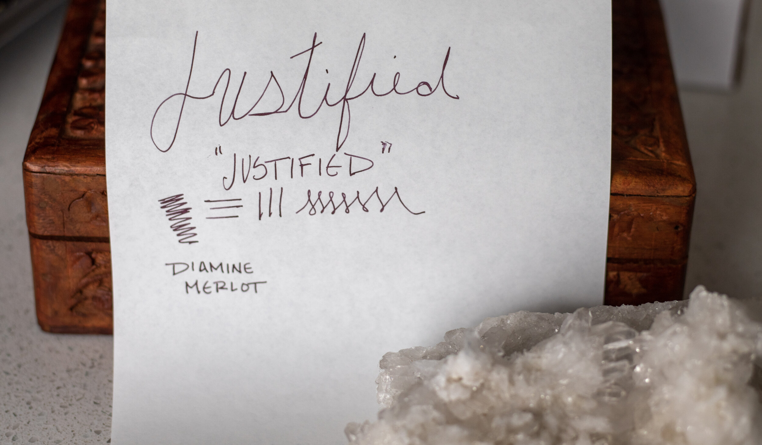
“Justified” - The Waterman Carène

While secluded in my apartment for the duration of this pandemic, I’ve had the opportunity to read, watch, and consume many different things. Currently, one of those things is the TV Show “Justified” starring Timothy Olyphant.

Side note -
Have you seen this show? Because when I started it, I did not get the Timothy Olyphant craze, but now I definitely 100% get it…
The premise of the show is that the main characters are constantly faced with situations in which they need to make a difficult decision that may not be in line with either the law or what they have always assumed their moral code was. They do this under the guise of “it was justified.” Such a slippery little slope, but one that I am all too familiar with.
Did I need another pen? Absolutely not. But I justified the purchase to myself because of the inlaid nib, of which I am a big fan and felt that I needed to try more pens with this feature. In fact, I am sure many pen enthusiasts (or really anyone with a hobby) are very well acquainted with the art of justification. Maybe it’s a limited edition/special edition item and you know you have to jump on it while you have the chance, or maybe it’s in a color that you don’t have yet, or a nib you haven’t tried, or because you need to review it for your blog ;) …the list goes on.
My mental gymnastics are your gain, though, so let’s get to it!
History of the Waterman Carène
The Waterman Pen Company is based in Paris, France but was first established in 1884 in New York City by Lewis Waterman. It is one of the few remaining first-generation fountain pen companies.
At the outset, the company introduced its fair share of innovations in the fountain pen world, but throughout its existence, Waterman’s main selling point was always quality and reliability.
As time went on, Waterman innovated less and this relative conservatism in the industry eventually led to younger and more innovative competitors like Parker, Sheaffer, and Wahl-Eversharp gaining market share. In 1954, after struggling for a while, the American company ended up shutting down. However, they had a French subsidiary, Waterman-JIF, and it was doing well. The French branch ended up absorbing what remained of the American company and its British arm, resulting in the Waterman that we refer to today, headquartered in Paris.
Since then the company has been merged and sold a couple of times, and as of 2000 it is still currently owned by Newell Brands, which also owns a boatload of other companies across the spectrum (like Rubbermaid, Calphalon, Mr. Coffee, Paper Mate, and a ton more).
The carène model came out in 1997 and took “inspiration from luxury boat design”; “its pure fluid curves conjure up the sleekest lines of a leisure cruiser, or the billowing sails of a luxury yacht.”
Ironically, it appears not to be connected with the company’s name “Water-man.”
Per the Waterman website, they have seven (7) other flagship pens that are currently in production, though I personally do not know about these other styles.
To be quite honest, the description from Waterman sounds a bit pretentious to me, and maybe it’s my lack of interaction with luxury yachts (or any yachts…) but I didn’t think of a boat when I saw this pen. I mean, I suppose now that they mention it, I can kind of see it, but it wasn’t my first, second, or third thought. Though maybe if I knew some French I would’ve had a hint, as “carène” means “hull” in French.
In general, though Waterman has a storied past in fountain pens, it seems to be one of the less popular pen brand choices of today, and, as mentioned, I personally am only familiar with the carène, as that is the most well-known of their current lineup.
There are many different finishes for the carène, though the general shape and design remains the same. I happen to have the “Deluxe Black & Silver w/Gold Trim Fountain Pen” version, purchased from Atlas Stationers, a great family business and one of my fav go-to stores located in Chicago, IL.

Box that the carène comes in
You definitely get a bit more of the “water” vibe from this - the pattern is reminiscent of waves or rippling waters.

In this photo the pen reminds me more of an orca than it does a boat, but I guess it still gets a similar message across.
I do think this pen is stunning, and it certainly looks and feels like it belongs in the price range that it is - which is somewhere around $220-$600+ depending on the body/edition that you end up getting (some have leather on the body or special etchings).

The clip has a bit of flair to it, in line with the “wave” theme and you can see the tiny Waterman logo etched in.

Most nibs will have their size etched onto the actual nib itself, but on the carène, it is engraved onto the opposite side of the nib.
I believe that this pen is mostly offered in a medium nib size, but that you can get a fine on some models. I am unsure if it is sold in any other nib width, though.
It boasts an 18K solid gold nib, and it writes extremely smoothly out of the box. The nib feels a bit soft and is very rounded (versus say, the Lamy 2000 nib).
It’s definitely more of a “Western” fine - so a wider line width than a Japanese fine nib. It writes average - not too wet, not too dry.
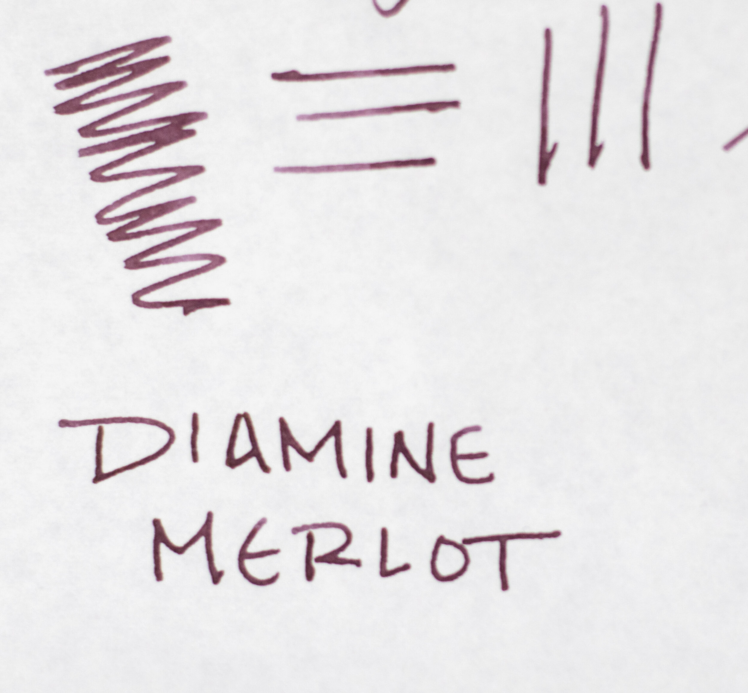
In the pictures below you can see I’ve inked it with Diamine Merlot.

The carène has a brass lacquered body which gives a bit of weight to it - for reference, heavier than the Lamy 2000 Makrolon, but lighter than the Lamy 2000 Stainless Steel.
I will say that it seems the material is prone to easy fingerprints and micro-scratching, so you won’t want to let it bang around in a bag or hard surfaces. A soft lining or setting it on a pen rest would probably be ideal to keep it in good shape.
I personally write with this pen unposted, as I think it’s too heavy with the cap, and the length unposted works just fine for me.
It fills via a catridge/convertor system, and it comes with both.
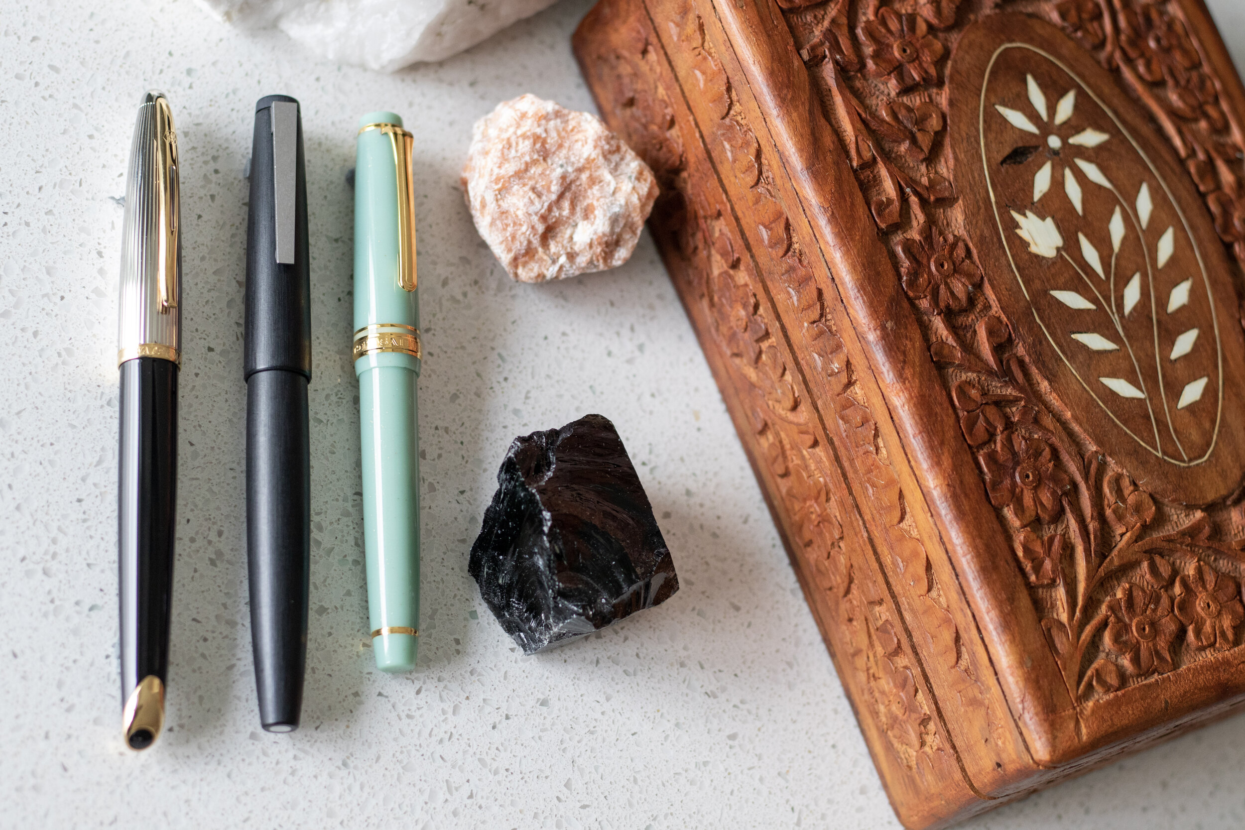
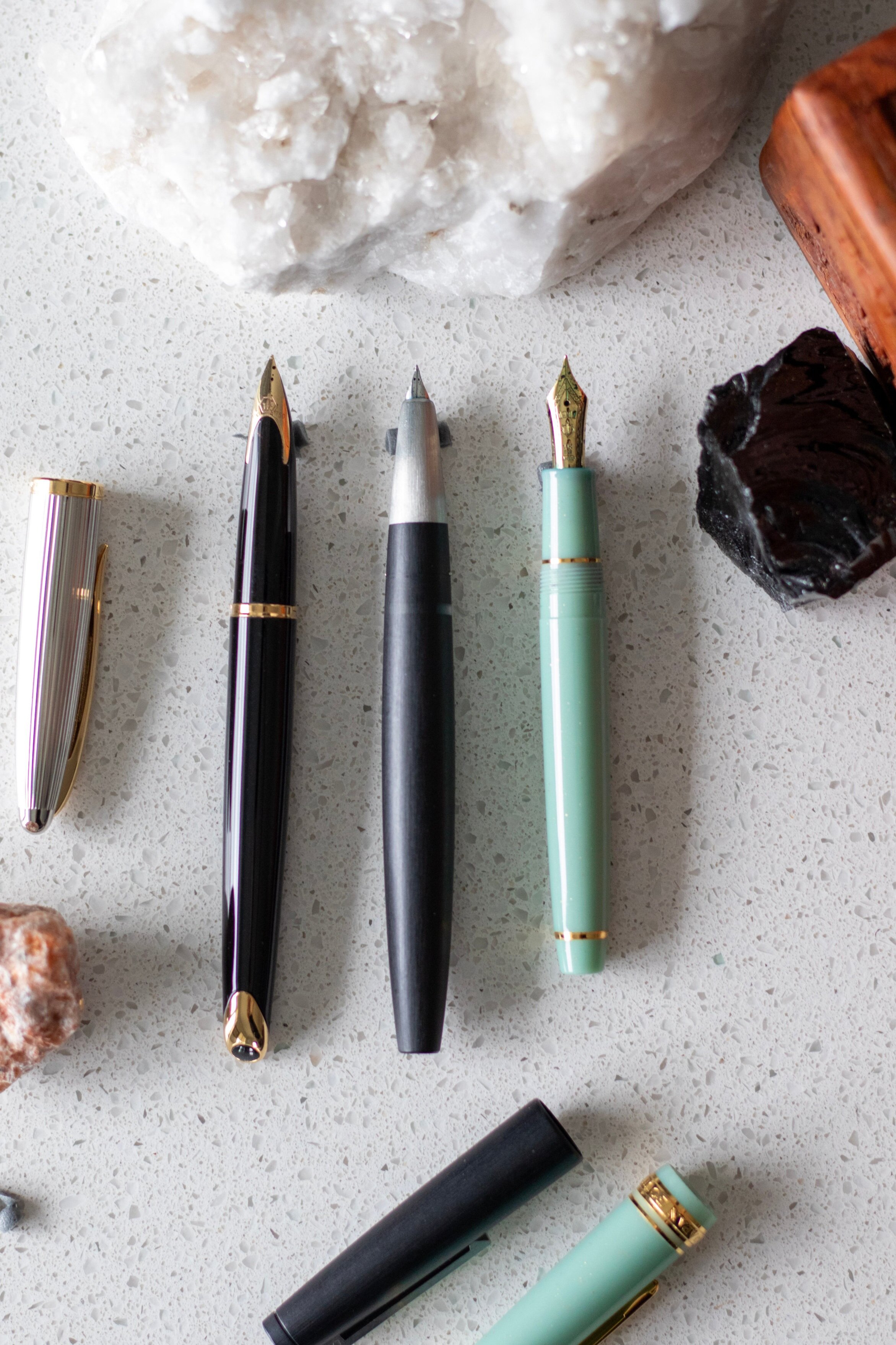
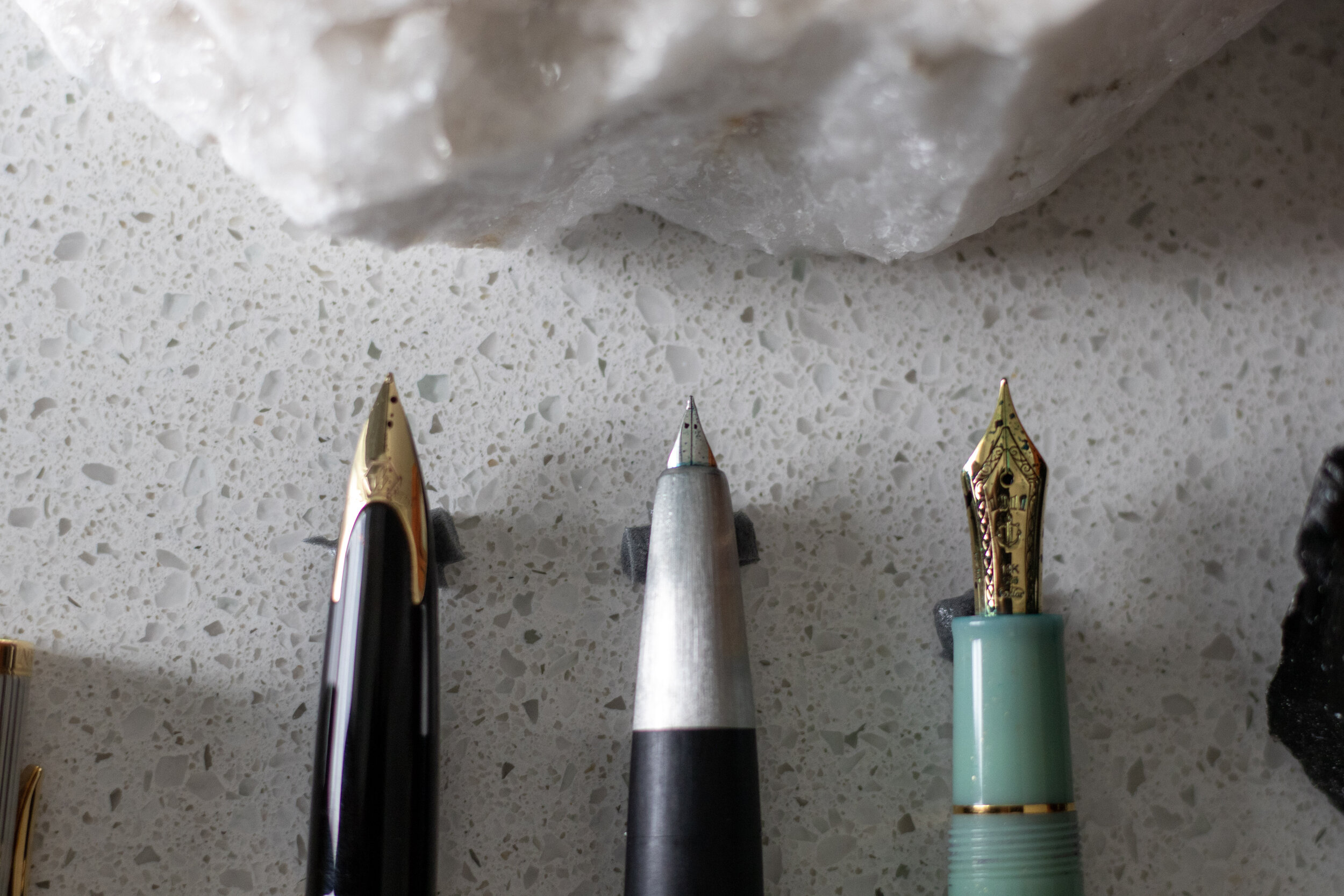
Above is a size comparison showing the Waterman Carène, the Lamy 2000 Makrolon, and the Sailor Pro Gear Slim - Dragon Palace. First image is capped, second is uncapped, and third is a nib comparison.
Final Impressions
Overall, I think this pen is very classy and it seems perfect for a business setting, or signing contracts on your yacht. It definitely looks and feels elegant. I’m not sure it is a pen that truly fits my personality, but I enjoy using it.
When the pen is capped, I feel like it is more reserved, but uncapped, the sleek black body with the unique gold nib inlay, it feels a bit more adventurous, and even a little intimidating.
Middle Earth Rating - Elvish
Since I made this blog with the idea of curating a bit of a hobbit-y type collection of things, I thought that maybe I should give each pen or item I review a “rating” based on my knowledge of Middle Earth and where I think that item might fit in - as not everything I use would seem at home in the average hobbit hole.
Due to the ties with water and boats, it seems to me that the Waterman Carène would be most comfortable with the elves. Many elves of Middle Earth as associated with elegance and grace, but with a dangerous side. While I wouldn’t consider them “business-y” or extremely structured, they do appreciate and practice fine craftsmanship.
Additionally, we know they travel by boat to the Grey Havens, that they have expertly crafted water vessels that they lend to Frodo & Fellowship, and we learn in the Silmarillion that the Teleri elves became enamored with the sea when they first laid eyes on it, and desired nothing more than to live close to the shore. They were even nicknamed the “sea-elves” because of this and their love of Ulmo (one of the Valar who was Lord of the Waters).
Thanks for reading this far and I hope this was helpful! Let me know in the comments if you have any questions, comments, or feedback on this post. Maybe something you’d like to see more of, see less of, or something I didn’t think to include.