
Montegrappa Harry Potter - Gryffindor
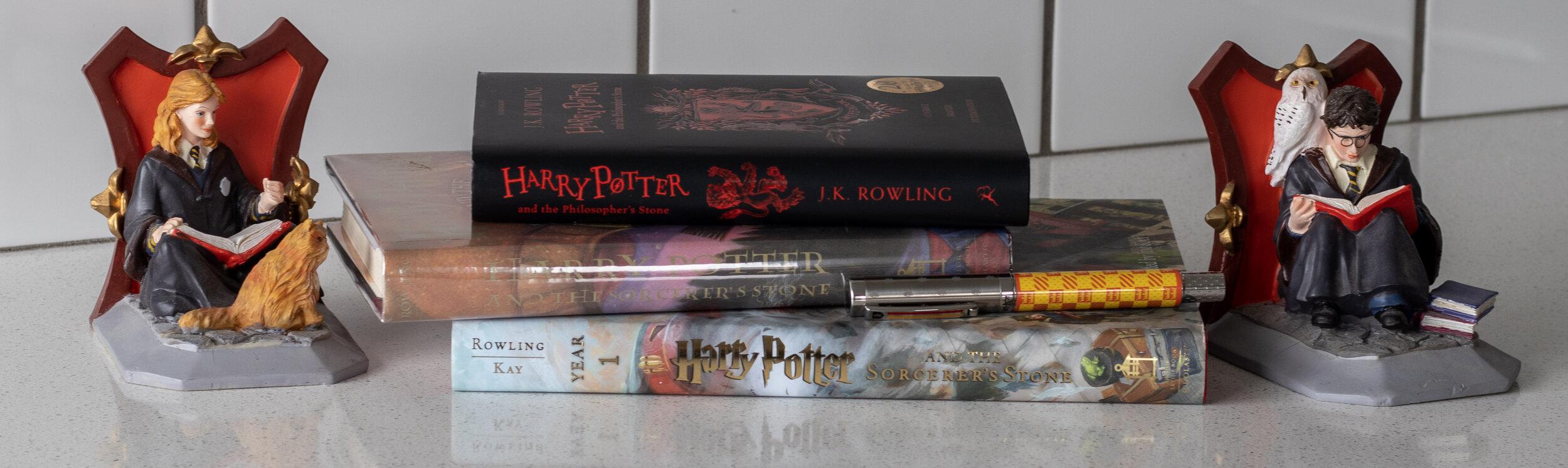
Pictured: Some very old bookends of Hermione Granger & Harry Potter, a copy of Harry Potter & the Philosopher’s Stone - UK Edition (top), a second edition copy of Harry Potter & the Sorcerer’s Stone - hardcover (middle), the fully & beautifully illustrated version of Harry Potter & the Sorcerer’s Stone (bottom), and of course the Montegrappa Harry Potter Gryffindor Fountain Pen
I am finally going to review this pen. Disclaimer - I do not endorse or approve of JK Rowling’s stance/viewpoint regarding trans people. In my opinion, this issue is complicated because of the deep ties that the Harry Potter series has in “outsider” circles - many of which include LGBTQ+ people - who read the series growing up and felt comforted (though of course I can only truly speak for myself - a cis white woman). There is much discourse and nuance in the realm of art regarding art transcending the artist. In general, I do not feel that this topic is able to be put succinctly or in terms other than “grey.” What isn’t grey is that trans men are men and trans women are women and that being anti-trans is being anti-human.
This series means something to me that I can’t really put into words and so it is unfortunate (to put it mildly) that the author has proven to hold harmful views. My hope is that the good that Harry Potter has brought into the world outweighs the smallness of Rowling’s personal thoughts.
Montegrappa: A History
In the fountain pen industry, Montegrappa is a brand often associated with extreme, outlandish, and even gaudy limited/special edition pens that pay homage to pop culture icons. While Montblanc has themed pens that some might say are more “high brow” (for example, their Writer’s Edition series), Montegrappa is a bit more fun and silly, in my opinion.
The Harry Potter Fountain Pen by Montegrappa is somehow on the quieter side when it comes to some of the more intensely themed pens, though it does boast bright colors. If you’re unsure what I mean, take a look at their Lord of the Rings themed pen (which I desperately want and will never be able to justify price-wise), their Queen (the band) themed pen, their Alexander Hamilton pens, their Monopoly pens, their Game of Thrones themed pens, their Dante Alighieri: Inferno pen, and their Viking pen (which I thought was cool but didn’t want until I recently started playing Assassin’s Creed: Valhalla and now all I hear in my head is “Let’s go a-viking!”).
However, Montegrappa also has other pen models that are much more “every day” than the ones mentioned above (like the Elmo and the Zero). I do not own any other Montegrappa pens, and personally, I’m not drawn to any of the regular models. I’m all for the themes, baby!
Anyway, Montegrappa was founded in Italy in 1912, and a fun fact is that their products are still manufactured in the original factory in Bassano del Grappa (North-East of “fair Verona” for you Shakespeare fans).
Montegrappa (also the name of a mountain near the factory, in the alps) were leaders in the domestic market during World War I. There was a great need for soldiers to have fountain pens in order to stay in touch with their families and Montegrappa happily and successfully fulfilled this demand.
During this same time, Bassano was a center of military operations and a field hospital was set up temporarily near their factory. Two volunteer ambulance drivers for the Italian Red Cross were none other than Ernest Hemingway and John Dos Passos, both of whom also spent a considerable amount of time visiting the factory and testing pens.
As is the case in the history of most companies, ownership changed hands a few times and business went up and down depending on the times. After the early successes, business declined when the ballpoint pen was introduced to the market, and a journey for reinvigoration & relaunching began - a tale as old as time (or at least, one I’ve noticed in all of my fountain pen company researches so far).
So, today they’re not only known for their limited edition and unique pens, but also their reproduction of classic models like the Elmo.
A new and fun thing they’re offering is an extremely customizable pen. To my knowledge, this is one of only a few companies that offer an option like this and is a way to ensure that you have a truly bespoke piece, if that’s your jam.
I decided to make this a briefer overview than some of my other “history” sections because I like the general knowledge but not necessarily the nitty gritty. But if you’re into that, this site has some great detail (and is where I got a lot of my info), as well as Montegrappa’s own site.
“Well, if you’re sure - better be GRYFFINDOR!”
In the second half of 2020, Montegrappa released a series of pens based on the Harry Potter series. There is a pen representing each of the four (4) houses: Gryffindor, Ravenclaw, Hufflepuff (what the HELL is a Hufflepuff? -if you know, you know), and Slytherin, as well as a pen that combines all four houses and is just a “Hogwarts” pen.
I chose the Gryffindor themed pen because, despite my many attempts to take quizzes to get the result of Ravenclaw (I think I’m smarter than I am, obviously, which probably should actually put me in Slytherin…but anyway), I always end up with Gryffindor.
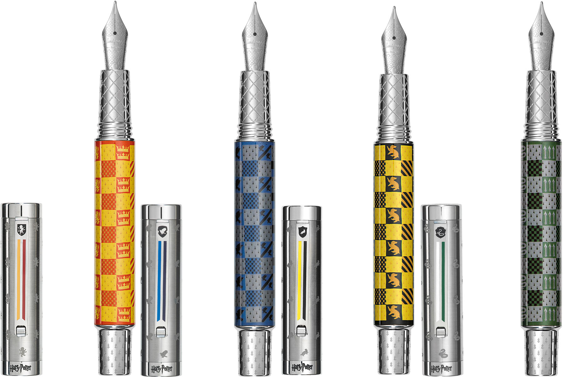
Image compiled of screenshots of pens from Montegrappa’s website

Hogwarts pen -image taken from Montegrappa’s Website
These pens were met with a fair amount of criticism due to a number of factors:
Steel nibs - for the price (about an average of $400 per pen), many people felt the pen should come with a gold nib. For myself, I did buy this pen during a sale at Atlas Stationers that brought that number down by a hundred, but still, it is an expensive price for a pen with a steel nib. When you consider that you can get a Sailor Pro Gear with a 21kt gold nib for somewhere around $270-$300 or a Pilot Custom 74 with a 14kt gold nib for about $160 it does give one pause. However, the materials used for the body and cap of the pen (stainless steel & brass, as opposed to resin aka plastic), along with the specialized theme & engravings, it’s not so hard to imagine the pricing.
JK Rowling’s stance on trans people - to be honest, I can’t remember when the controversy started and when it became apparent that there was no miscommunication or misunderstanding - that Rowling truly does not believe that trans women are women, but I believe that it was either around the same time or recent enough that when the pens were announced, it left a bad taste in people’s mouths. I don’t disagree, and I think that all criticisms of the author are fair. It makes sense to me that many did not want to purchase a pen that would seemingly support Rowling (though I do not entirely know how the profits work on items such as this).
The design - given Montegrappa’s other limited/special edition pens, many people felt that this design was boring, garish, cheap-looking, and/or too sporty (versus say, wizardy). I will say that my first impression was “excited because it’s Harry Potter but also a bit underwhelmed.”
Ravenclaw - in the books, the Ravenclaw colors are blue & bronze, but in the movie franchise, this was changed to blue & silver. Additionally, the mascot for Ravenclaw in the books is an eagle, while the movie franchise has a raven. This irks many “Ravenclaws” and has been an ongoing complaint since the movies came out. The Montegrappa pen follows the movie version of colors and mascots, and so I know that many people are frustrated with this.
Likely, this list isn’t comprehensive, but let’s move on…
The Pen Chooses the Pen-Holder, Harry
(or something like that)
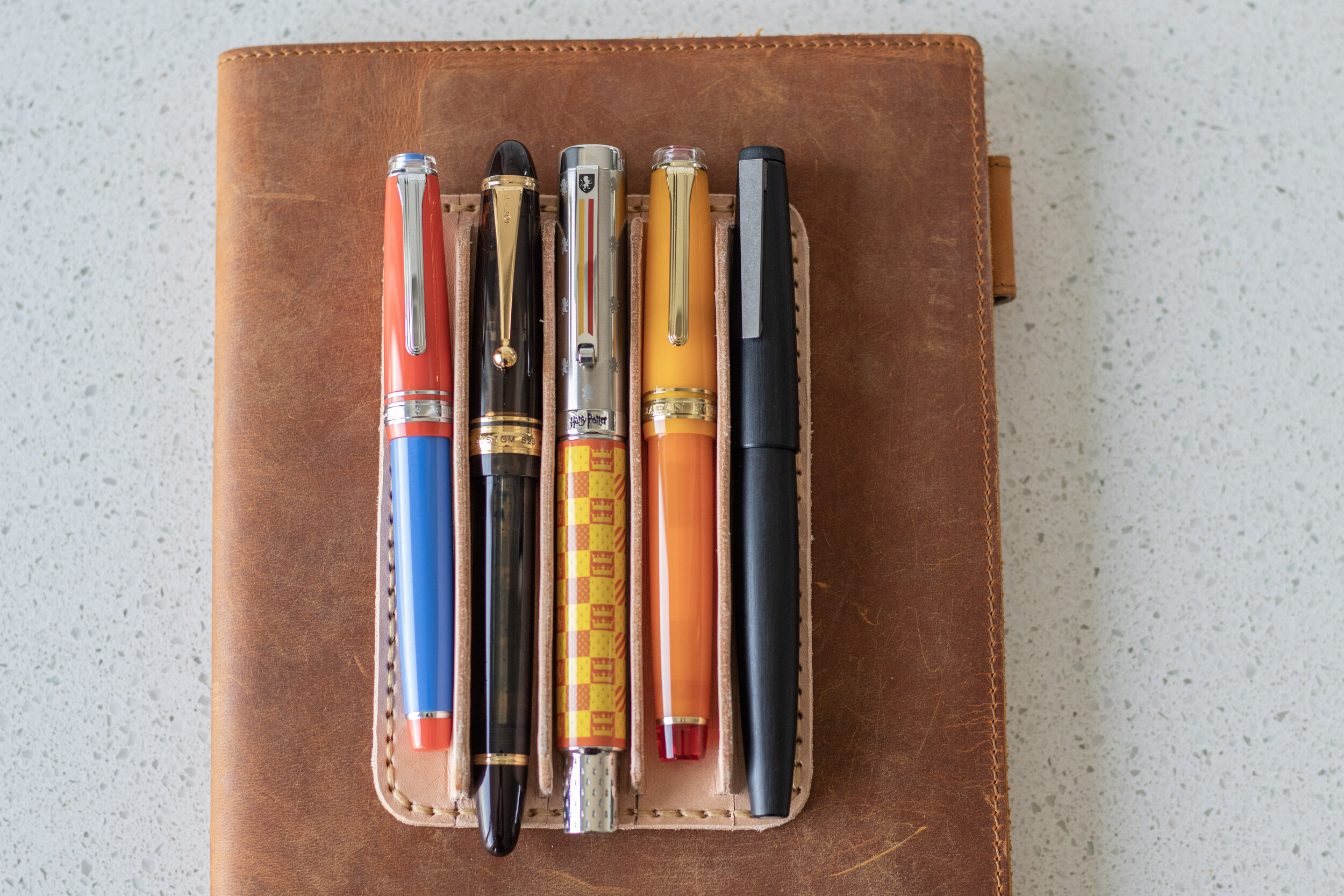
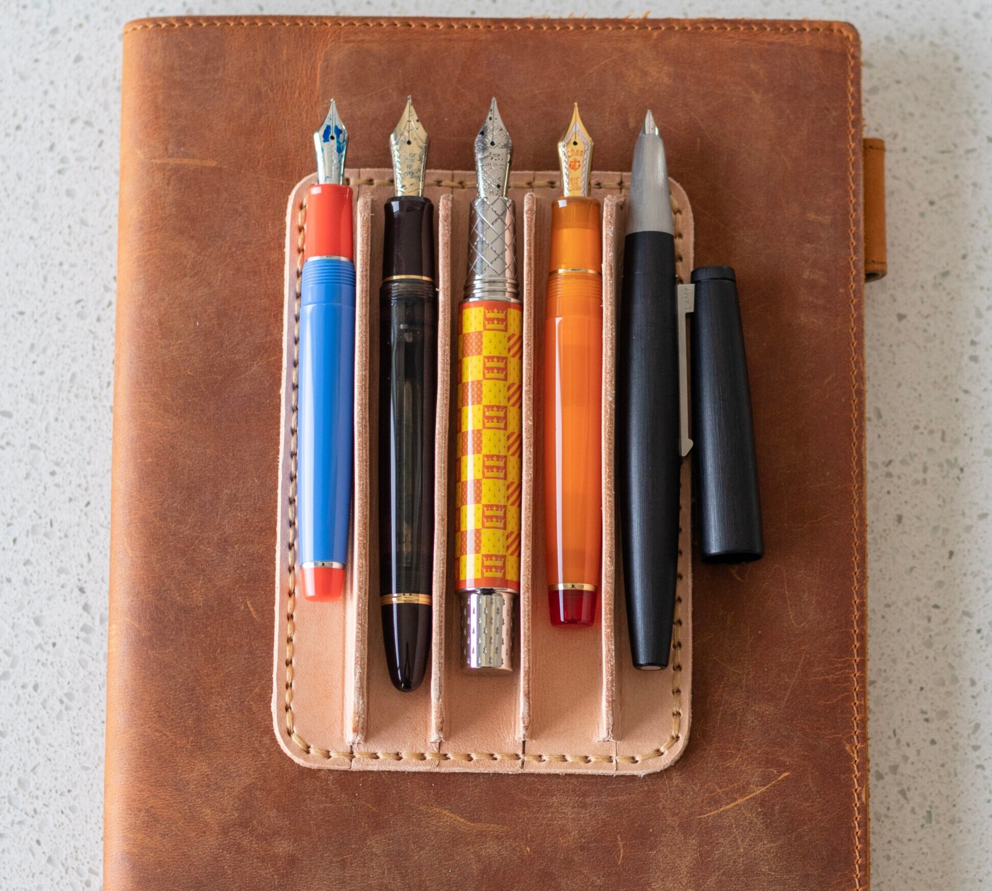
Pictured here in order of left to right:
Bungubox Hello San Francisco Sailor Pro Gear Slim, Pilot Custom 823 in Amber, Montegrappa Harry Potter Gryffindor Pen, Sailor Pro Gear in Tequila Sunrise, Lamy 2000 Makrolon
I feel this picture really gives a good idea of what the pen looks like in reference to some of the most commonly used pens out there. It’s closest in size (length, diameter, nib size) to the Pilot Custom 823, but it’s quite different than all the pens shown here in terms of weight.
The Montegrappa HP pens are made out of brass and stainless steel versus the more commonly used resin and the less commonly used makrolon.
Quick weight comparison:
Sailor Pro Gear Slim
Overall - 17g (0.60oz)
Body - 10g (0.35oz)
Pilot Custom 823
Overall - 29g (1oz)
Body - 19g (0.7oz)
Montegrappa HP
Overall - 60g (2.12oz)
Body - 37g (1.31oz)
Sailor Pro Gear
Overall - 22g (.78oz)
Body - 13g (.46oz)
Lamy 2000
Overall - 25g (.9oz)
Body - 15g (.5oz)
To sum it up - the weight of the Montegrappa HP body is almost triple that of pens like the Sailor Pro Gear and Lamy 2000, more than triple the weight of the Pro Gear Slim, and about double the weight of the Pilot Custom 823. Still, I find it comfortable enough to write with, though I definitely don’t write with it posted. I’d honestly be surprised if many people did.
The pen uses a cartridge/converter filling system. I like all kinds of filling systems, so this is fine with me. The thing I like most about the converter in this pen is that it actually twists into the feed, versus just pushing it in. I think this helps keep an air tight seal, which in turn makes sucking up ink more efficient.
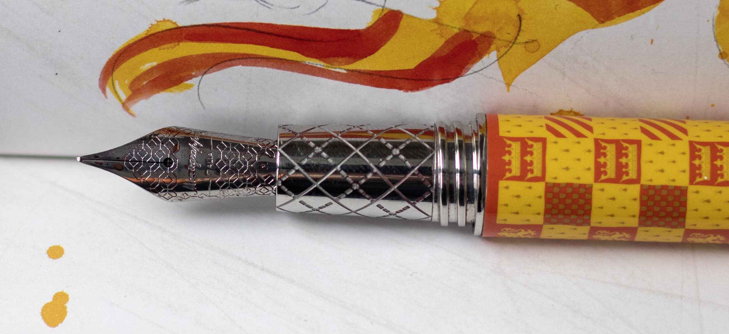

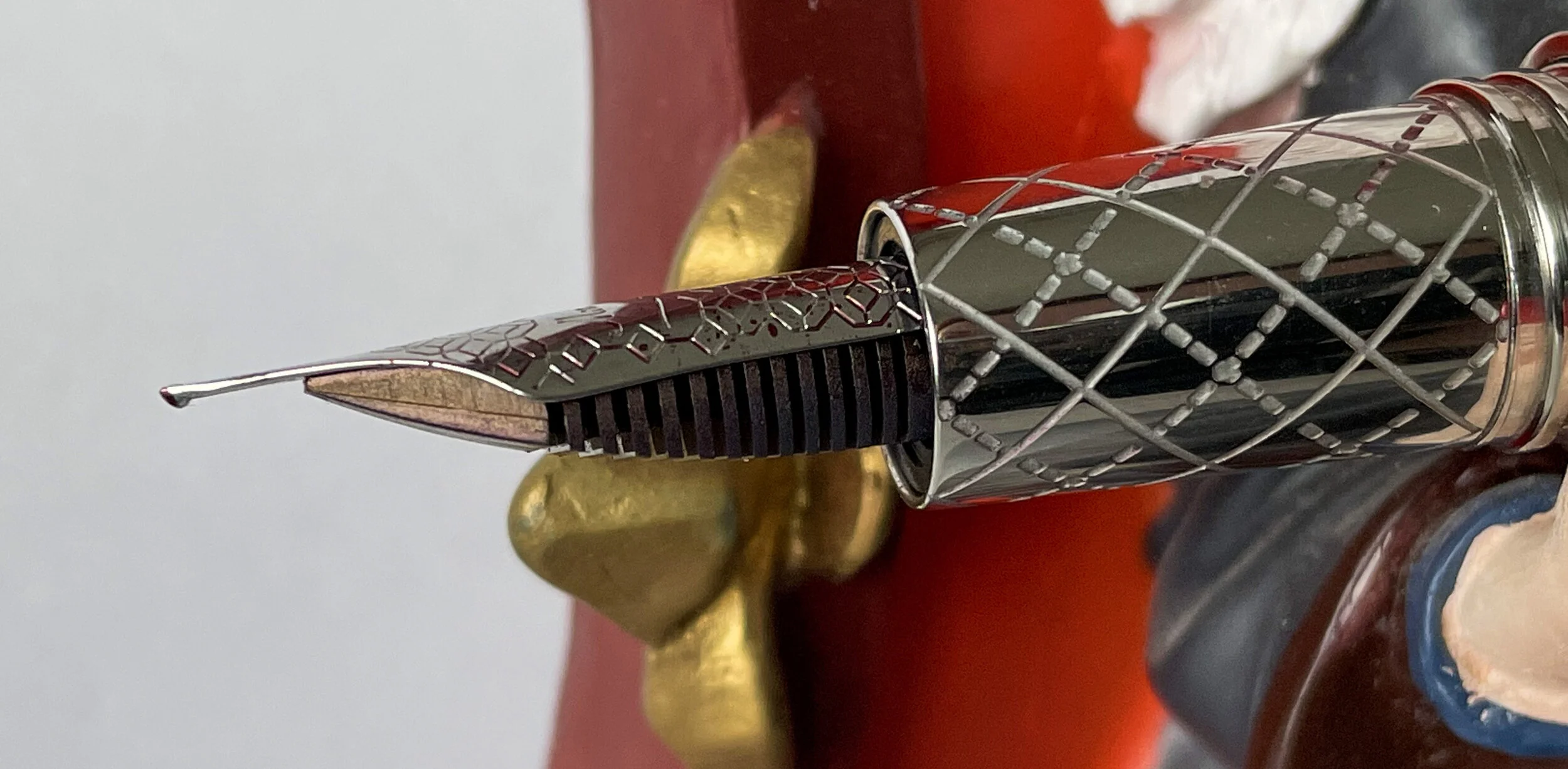
As mentioned previously, the nib is stainless steel and the design is pretty standard for Montegrappa. It’s the design that comes on most of their nibs (like the Elmo, the Zero, other special editions).
The nib is a #6 Jowo nib, comparable to the Pilot Custom 823’s nib, which is a Pilot No. 15 size - roughly the same as the #6 Jowo and other German No. 6 sizes (same nib that comes on the Esterbrook Estie -my review of the Honeycomb here)
Quidditch Through the Ages
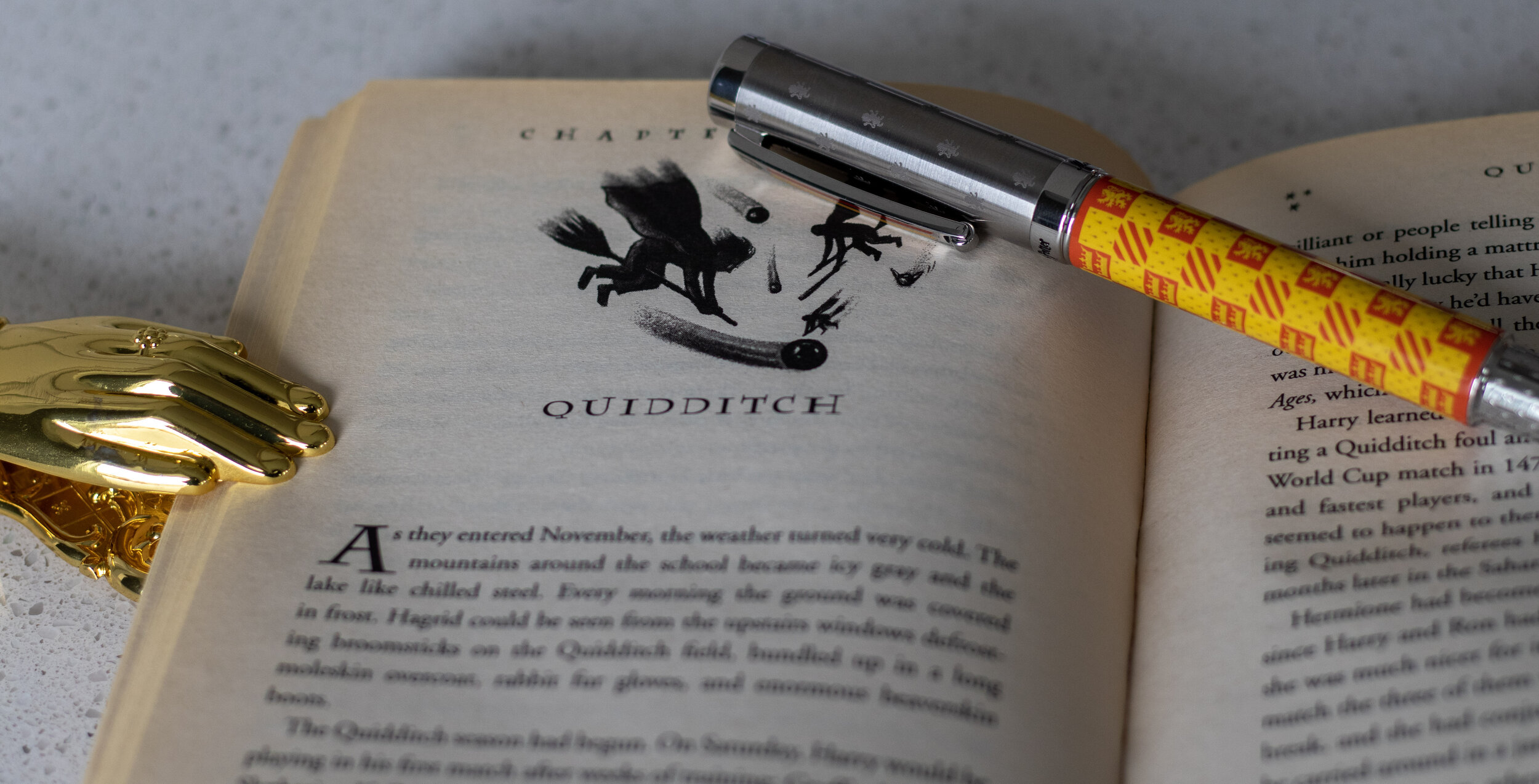
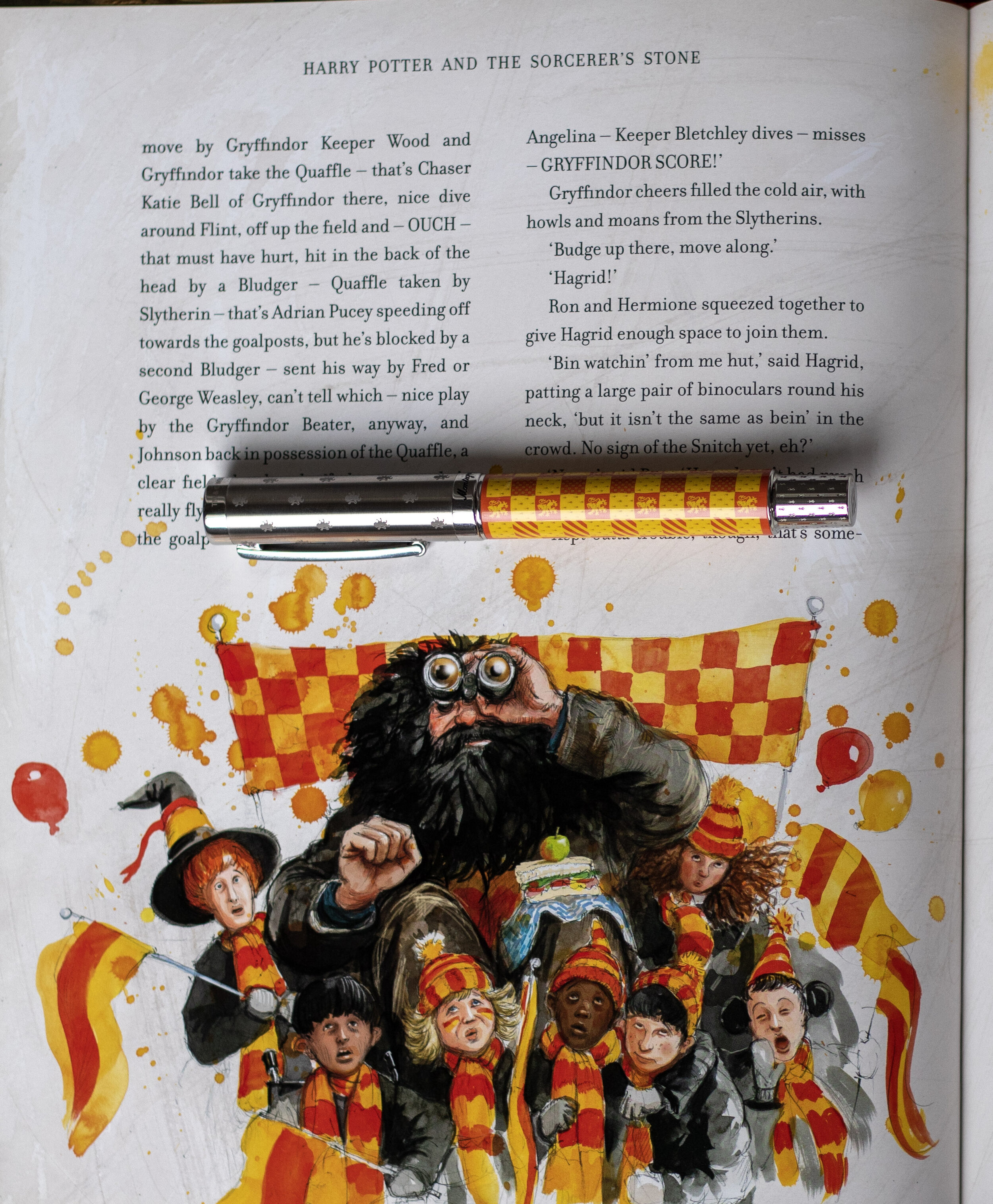
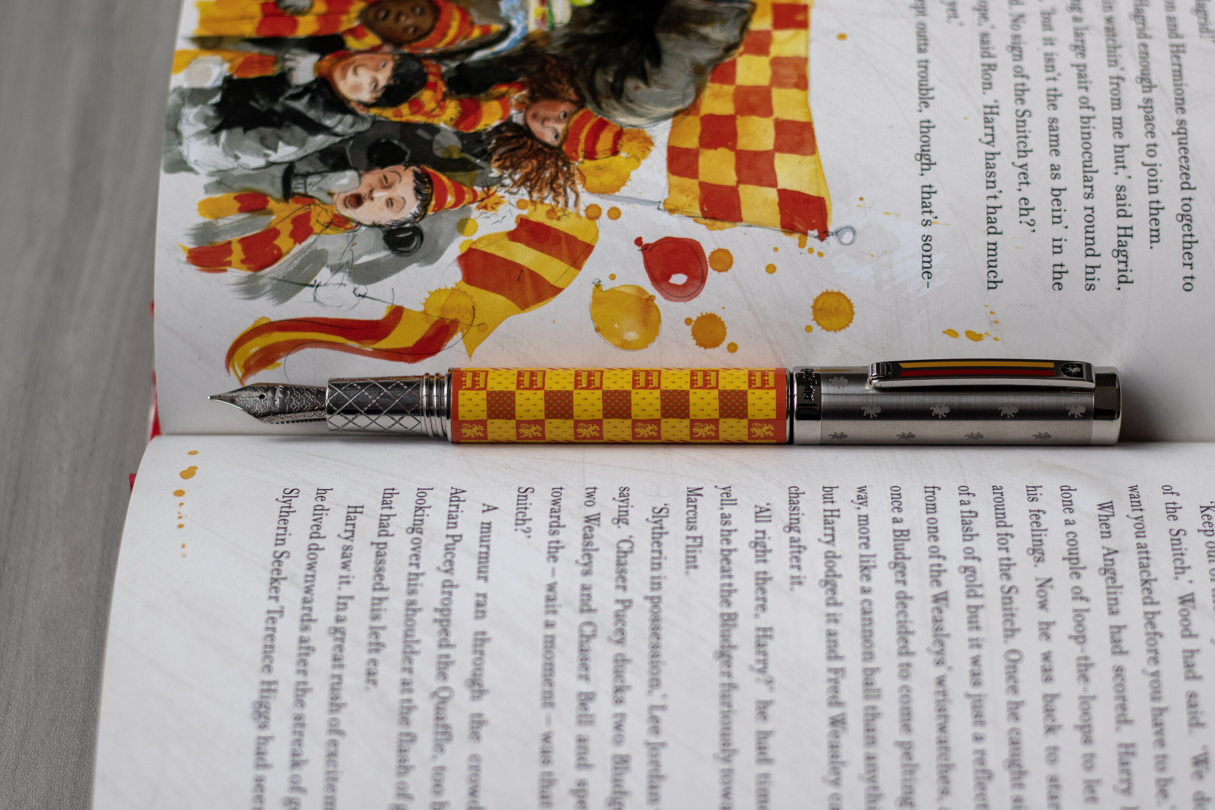
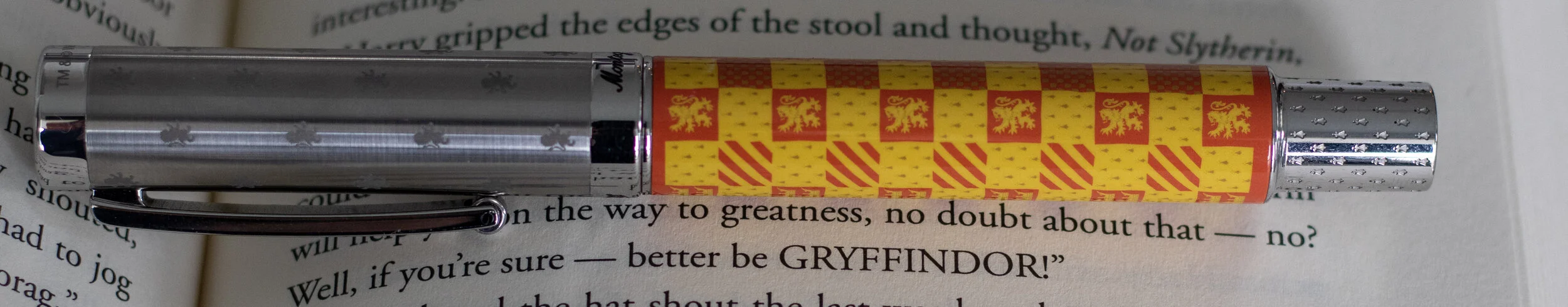
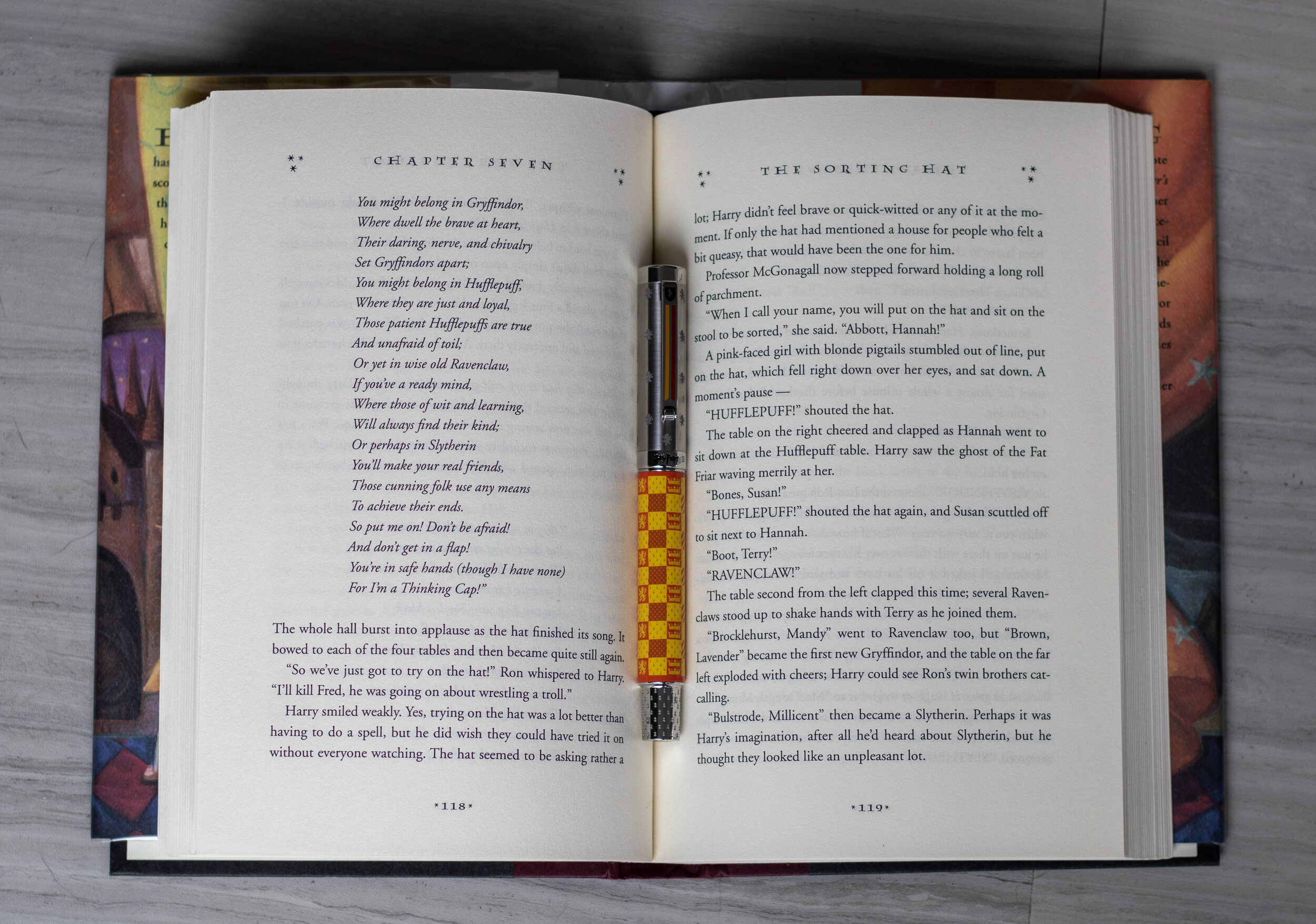
This section is really just a gratuitous inclusion of pictures of the pen with my copy of the completely illustrated Harry Potter and the Sorcerer’s Stone (though the first picture is actually with my OG paperback copy of said book). This page illustrates the first quidditch match that Harry plays in, but I think more than that, it demonstrates what a great job Montegrappa did with the (most commonly used) Gryffindor colors and quidditch motif.
The pen fits in seamlessly with this page, which includes Gryffindor scarves, flags, hats, and their banner - things you’d see at any sporting event. As a sports fan, I enjoy the theme. It clearly says “Harry Potter” but it also could simply say “sports” to someone who isn’t familiar with the series. Admittedly, it says more “UK football” than anything, but still, it’s not overtly wizardy, which can be both good and bad, in my opinion.

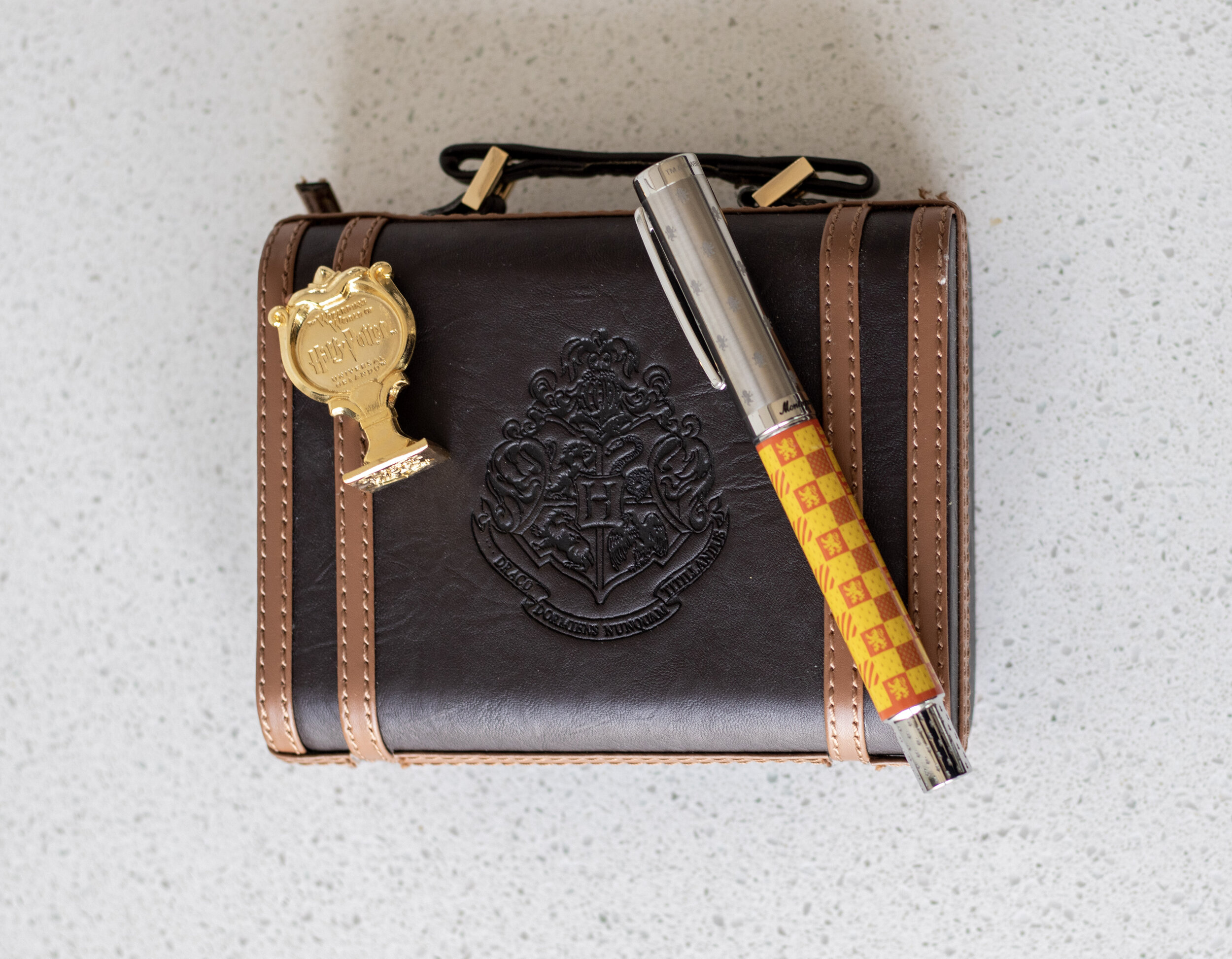
A close up of the cap and the finial show some more fun details tying things together - you can see the engraved Gryffindor mascot repeatedly on the cap, and an enamel shield with a steel lion on the clip. The Gryffindor house colors are demonstrated in the two stripes running down the clip as well.
Directly under the clip, “Harry Potter” is engraved on the band in the classic American font (used for the Scholastic editions of the books and the Warner Bros movies).
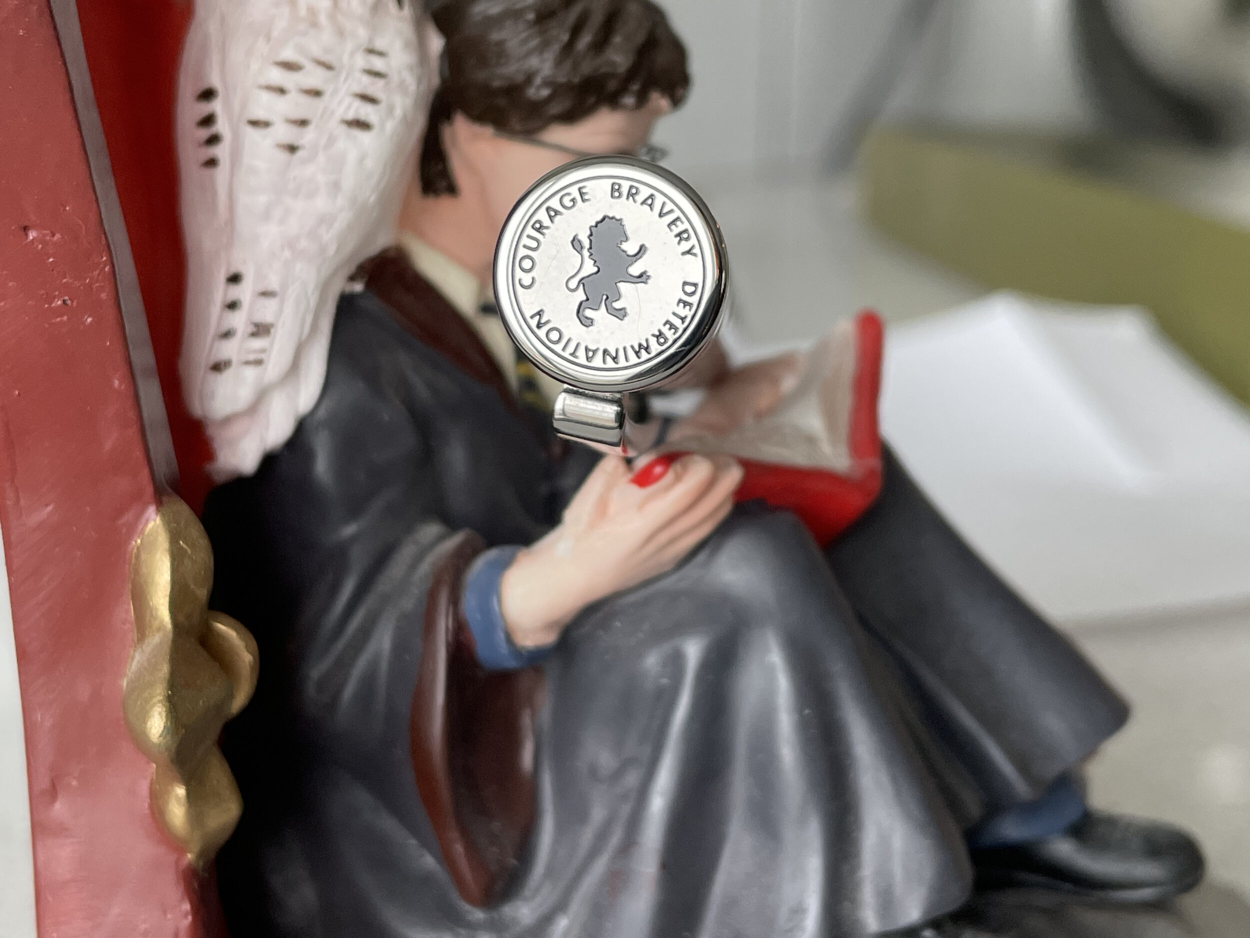
The top finial of each House pen includes inscriptions of their respective house values, as well as their House mascot.
I don’t believe these are specifically listed in the books as they appear on the finial, but they are implied directly or indirectly in the Sorting Hat’s song (someone let me know if I’m wrong here…I like to think I know HP pretty well, but time makes fools of us all). See the last image above for a picture of the pen with the first Sorting Hat song!
Here’s what all of the caps say, respectively: Wisdom, Wit, Learning (Ravenclaw); Patience, Dedication, Loyalty (Hufflepuff); Pride, Ambition, Cunning (Slytherin); and Courage, Bravery, Determination (Gryffindor).
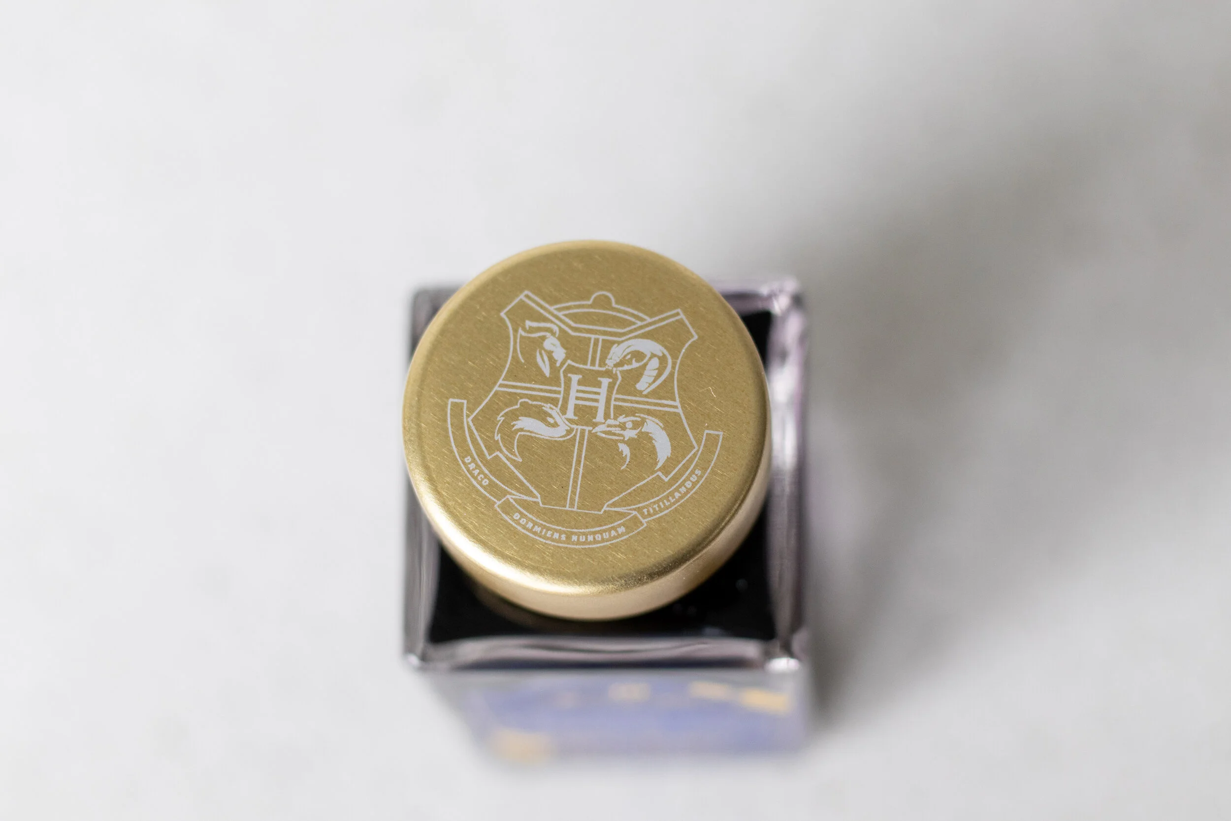
The Hogwarts pen simply has the Hogwarts crest on the finial.
Giving Flourish and Blotts a Run for their Galleons
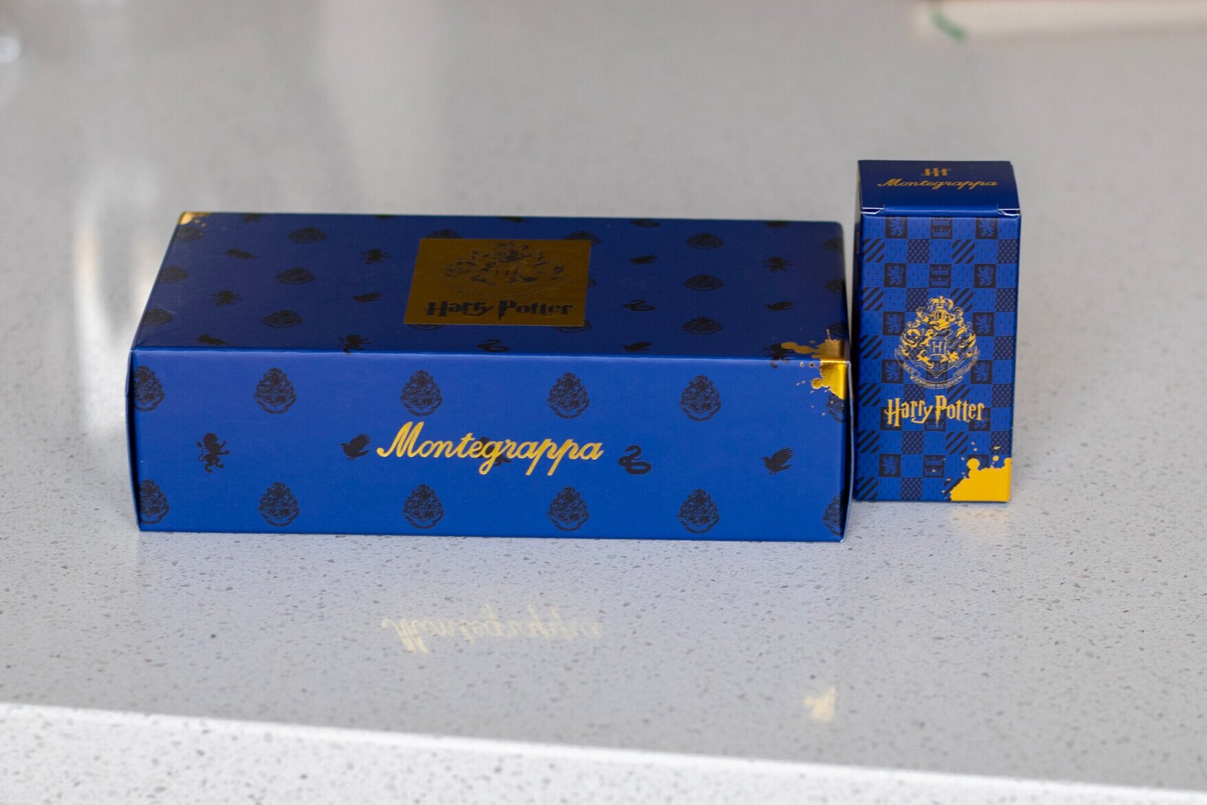
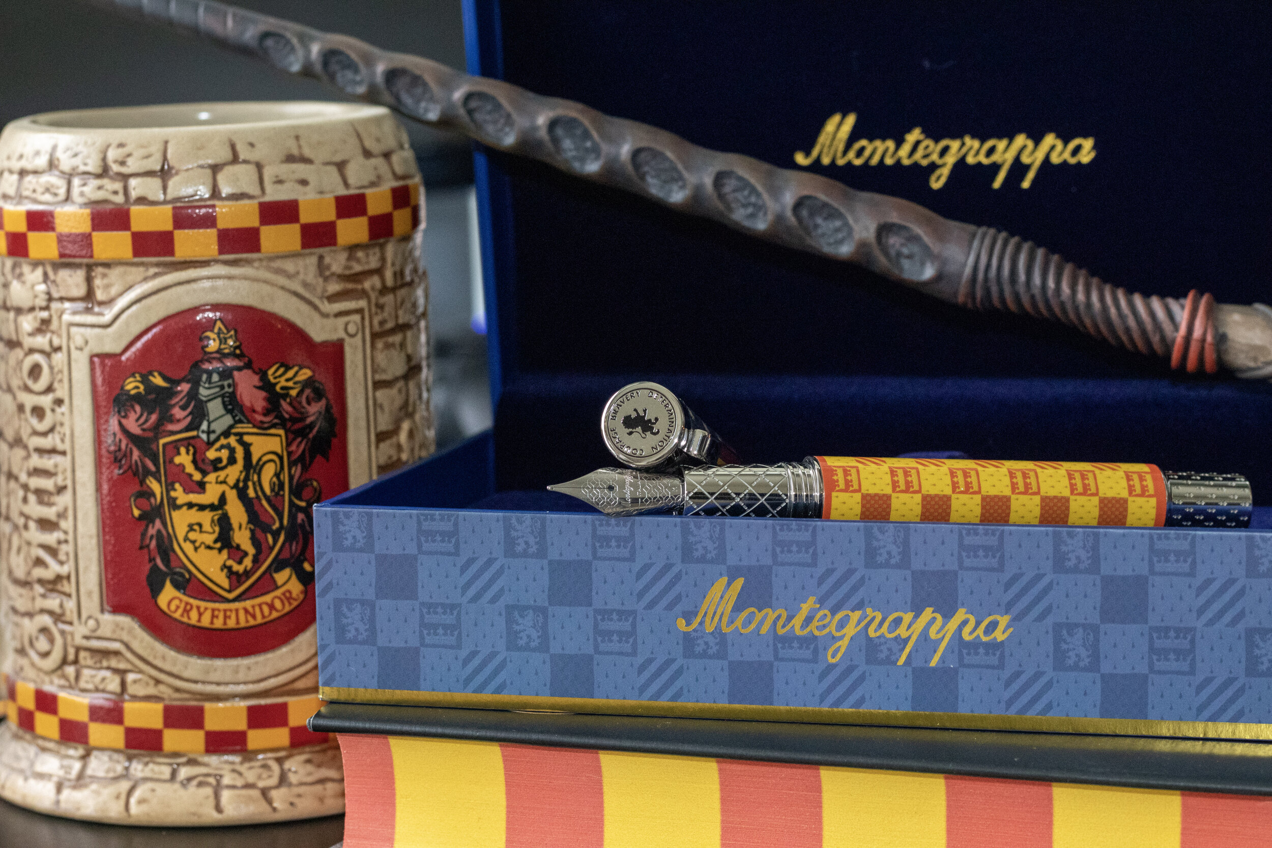
The unboxing experience of this pen is, indeed, pretty magical. I am a sucker for marketing and I feel that that Montegrappa did a great job with the packaging for these pens.
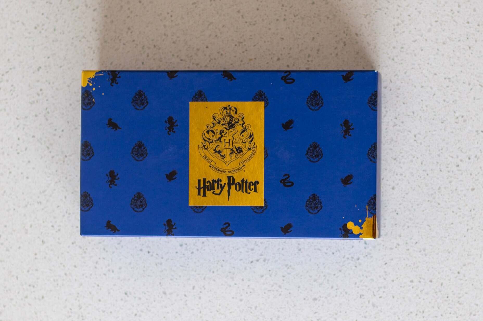
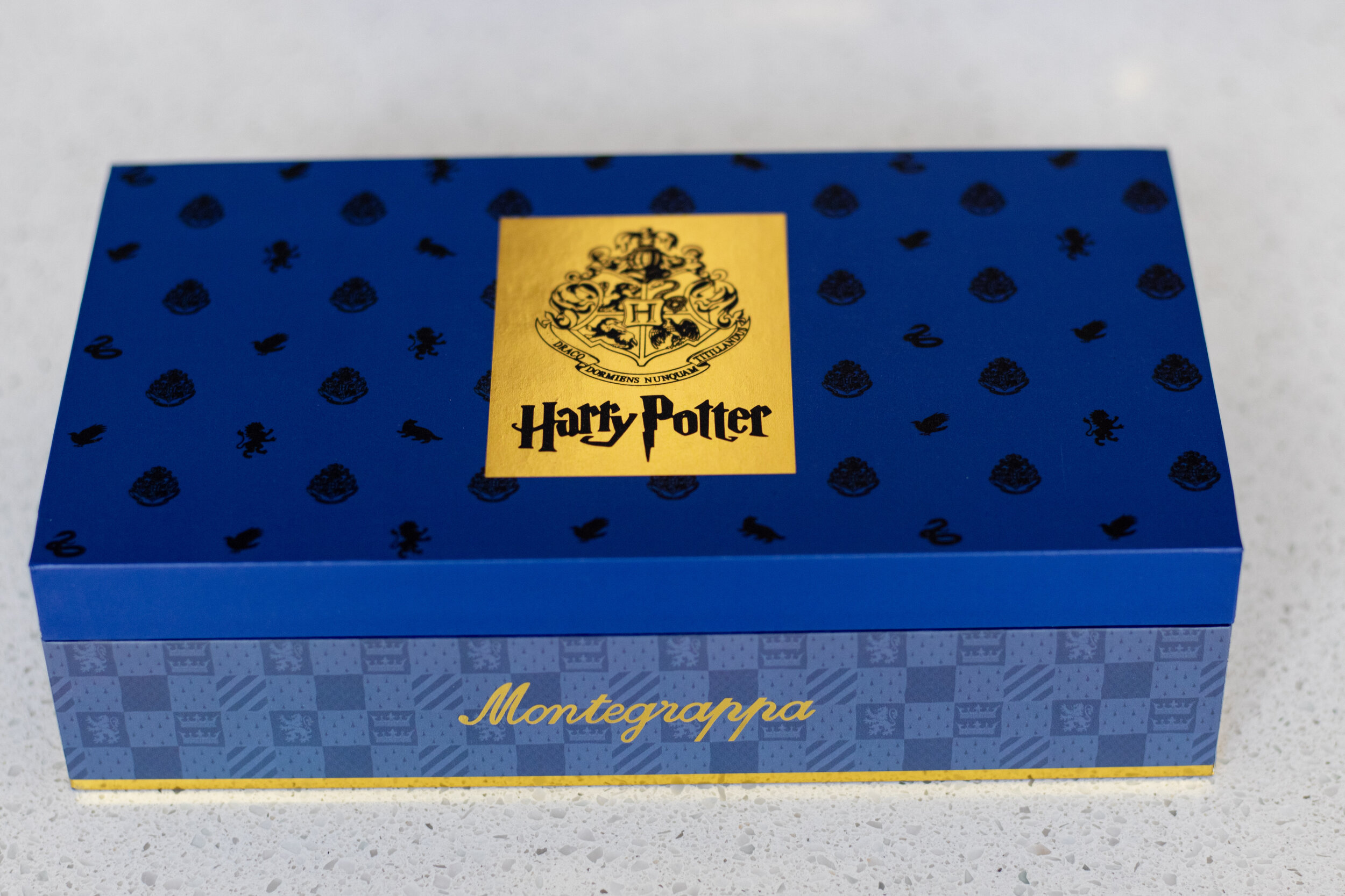
First, you encounter an “outer box” that is deep blue with the Hogwarts crest and the house mascots printed all over it. It has metallic golden splotches of ink which definitely give off magical vibes - maybe some spilled Felix Felicis?? The top has a metallic gold label featuring the Hogwarts Crest and and “Harry Potter” written in the American/movie font.
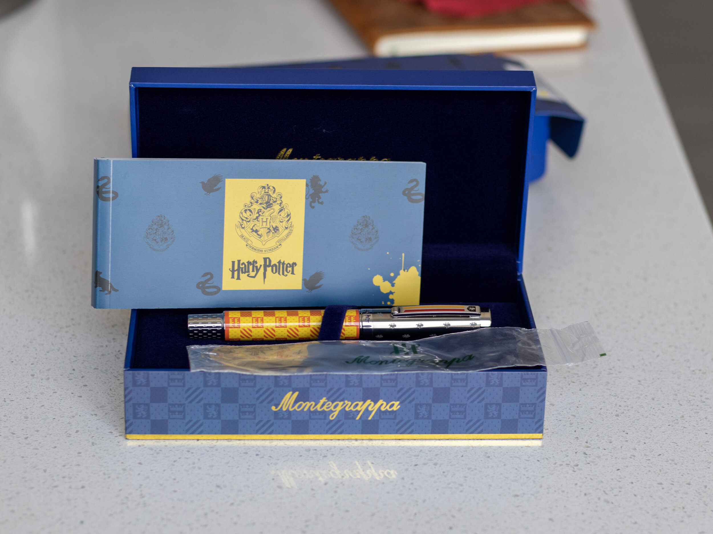
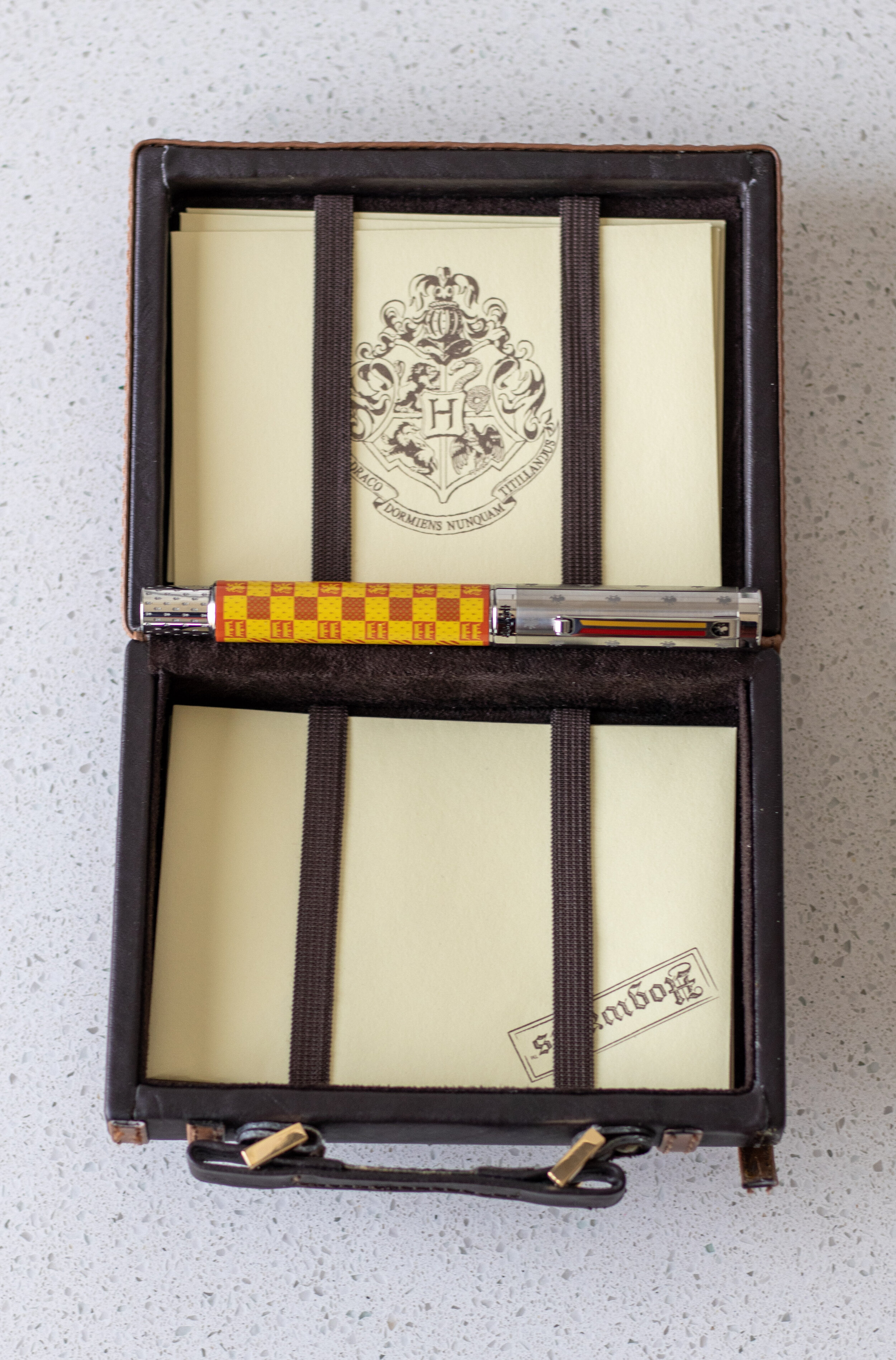
Then you pull out the “inner box” which looks similar to the outer, but has the Gryffindor pattern on the bottom half (though in shades of blue). The box opens on a hinge and the pen rests on luxurious deep blue velvet. The box has some heft to it, and it truly feels well-made and substantial.
The booklet it comes with is HP themed, but it really just contains information on how to take care of the pen in multiple languages.
It does come with two (2) blue cartridges, as well as a convertor.
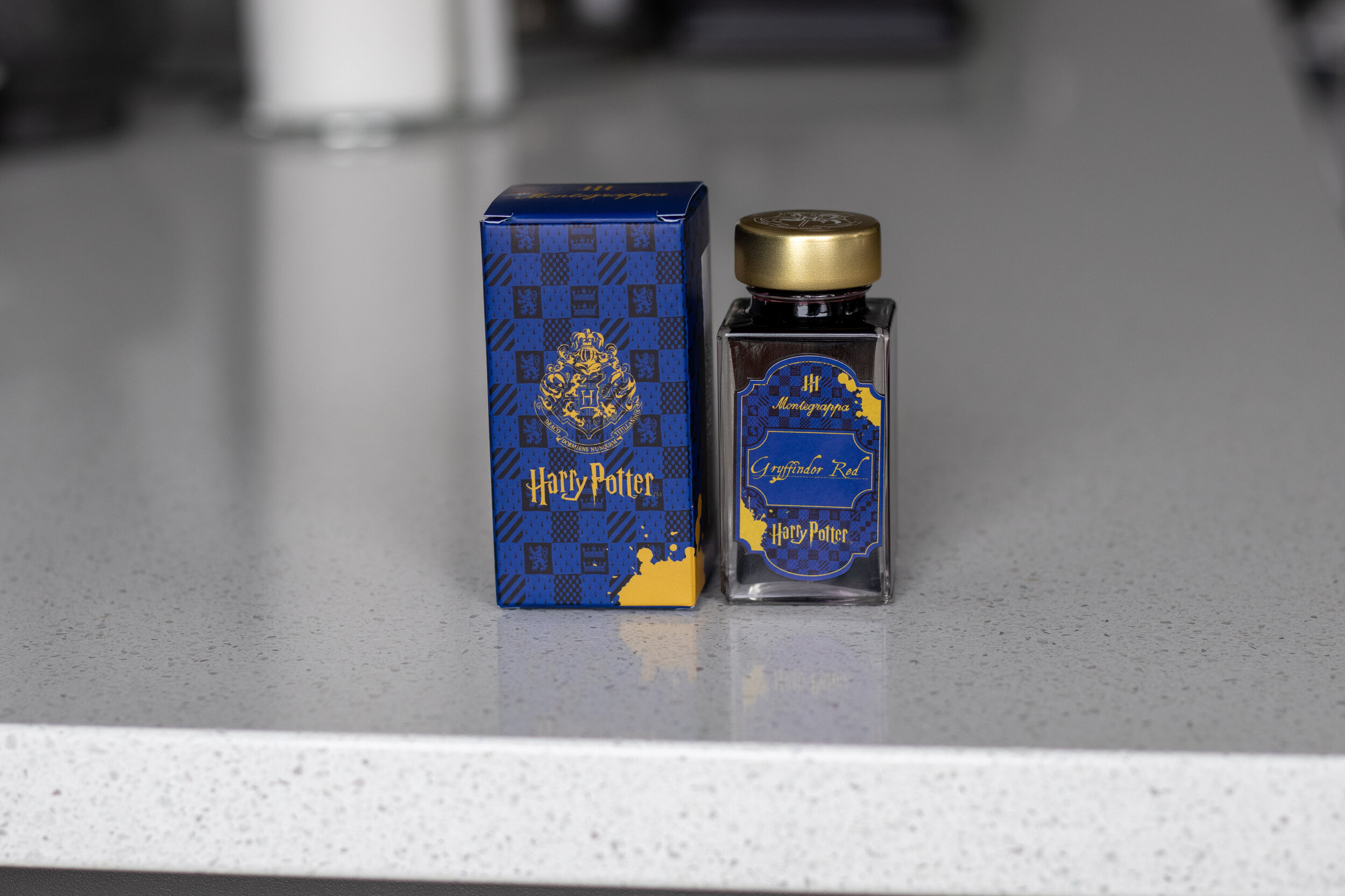
The Gryffindor ink bottle does not come with the pen, but I bought it at a later date when Montegrappa released them because it seemed wrong not to (again…I am the ideal consumer, heh). I included pics here so you could see the theme continuity, but more on the ink below.
I really like that the pen and ink boxes/marketing match - it makes for a nice set! They made inks for each of the Houses - Gryffindor Red, Hufflepuff Yellow, Ravenclaw Blue, and Slytherin Green, as well as a Knight Bus Purple and Thestral Black.
I’d still rather shop at Flourish & Blotts (can you imagine an ink that changes colors constantly?? how fun!) but unboxing this pen was still quite special.
I ordered my pen with a medium nib. I had previously tried a Montegrappa fine steel nib and it was much too thin (and a bit toothy) for me. Knowing that, I ordered this with a medium nib. However, that was a bit too wide. (Yes, I’m a goldilocks with nib widths)
SO I sent this to Gena Salorino at Custom Nib Studio to get an architect grind and I absolutely LOVE IT. It is one of my more crisp architects and it’s just a great grind.
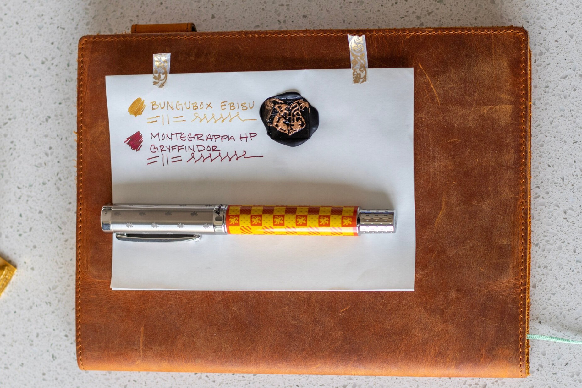
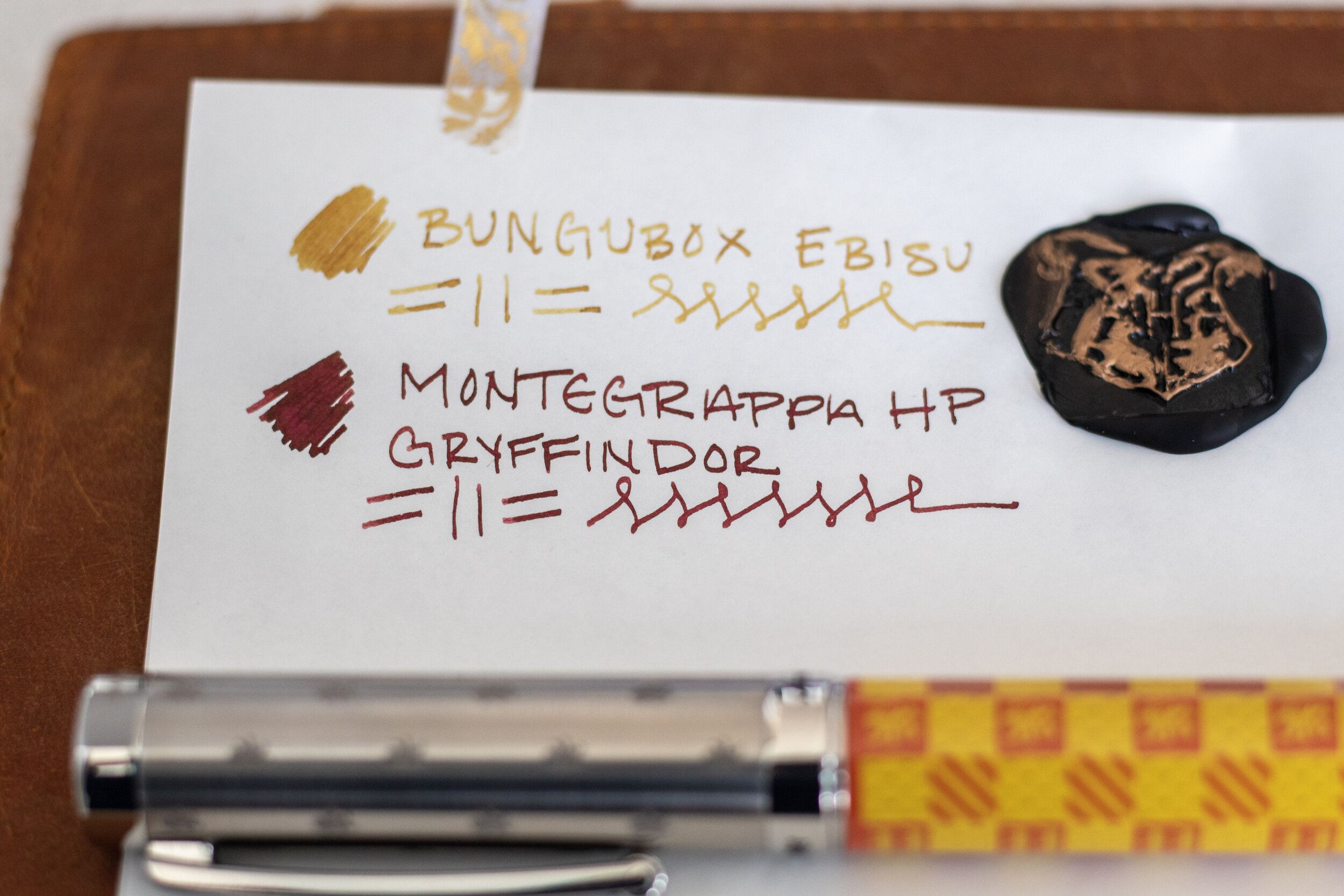
I used to have the pen inked with Diamine Oxblood which I highly recommend for a Gryffindor color. But as I was waiting for my Gryffindor Red ink to arrive, I swapped out the Oxblood for Bungubox Ebisu (shown above) and then finally inked it up with the Montegrappa Gryffindor Red ink (also shown above).
I love Ebisu and Gryffindor Red together as inks to represent this house!!
Also shown in the picture is a Hogwarts Crest wax seal that I (poorly) colored with a bronze sharpie. I got this wax seal in a set with gold and black wax when I visited the World of Harry Potter at Universal Studios many years ago (before they had even started building the second Harry Potter park - Diagon Alley).

Some quick shots of the Gryffindor Red ink bottle!
Mischief Managed

My final impression on this is that it’s a very well-made pen. It feels very high-end in the hand with the materials used and the subsequent heft they lend. I think all of the etchings/engravings and enamel parts are very well done.
As I mentioned previously, the design choice is obviously a point of contention for Potterheads and everyone has different pen tastes as it is, so take that for what it’s worth.
I kind of wish the red and yellow design on the barrel was more scarlet and gold (Gryffindor’s actual colors), but they clearly match the “mainstream” colors used often in HP marketing. Personally though, I think the deeper colors would make the pen look a little more elevated.
I know the barrel looks cheap to some people, but I think to keep the pen more affordable, this makes sense. If the barrels were hand-painted (and/or had maki-e designs), the cost would sky rocket.
It seems to me that they made this pen with a specific audience in mind, and that audience would consist of millennials who might splurge on something because they have a connection to it, but only so much.
I will say, if this pen was any theme but Harry Potter, I would not have bought it. The overall design is well done but not really my normal “type” when it comes to size, shape, and material.
If they made another Harry Potter pen…I’d probably buy it if it was in my price range.
Middle Earth Rating - Men
Ok this may be too easy, but I’m going with the race of men for this pen. It just feels like such a men (as opposed to the other races in Middle Earth - not genders) thing to make. Men bear the Gift of Men aka mortality. They are unique among the races for this, and because of it, fads, fickleness, and foolishness seem much more prevalent. (Beren - super cool hero, obviously, but I mean, risking his life and many others’ to get a freaking Silmaril from the Iron Crown for love?? Classic. Isildur & Boromir…need I say more??)
Being of the race of men myself, I can attest to the fact that I am extremely susceptible to all of these things and that is probably why this marketing scheme worked so well on me!
The weakness of men is their desire for power. This is a theme prevalent in Harry Potter - people like Cornelius Fudge, Voldemort, Dolores Umbridge, and, to a less evil extent, Ron. In the very first book, Dumbledore explains to Harry that he was able to get the Sorcerer’s Stone from the Mirror of Erised only because he didn’t desire to use it for his own gain and this motif continues through the series (Deathly Hallows anyone?). Then, there’s the other implied power struggle if the muggles knew about witches and wizards - they’d want the magic for themselves - kinda like wanting the One Ring.
The overall design and material choice also seems to fit - larger, clunkier, yet refined.
Thank you to anyone who clicked on this page and an even bigger thank you if you made it all the way through this meandering review! As always, I appreciate and welcome feedback. Be kind to one another out there. :)