
The Art of the Architect
OK fam! I’ve finally decided to do another blog post and today’s topic is about my favorite grind out there - the Architect Grind!
If you know me then you might be confused because I am not an architect - but stick with me here and things will start to make sense (I mean, probably, but no guarantees).
So, I’ve talked before about how fountain pens are so versatile. The deeper I dig into this fun hobby, the more wealth there is to find. It’s pretty obvious that different fountain pens look different - even within the same brand. And if you’ve read my previous posts (or are familiar with FPs in general) then you know that you can choose from different nib materials and widths. However, outside of these very common variances, almost everything about your pen can be customized or purchased to fit YOU and your style and it’s just bonkers how much there is to consider when one thinks of their “perfect” pen.
This isn’t the first time I’m saying this, and I am sure that it won’t be the last because it honestly has not stopped blowing my mind.
ALRIGHT TEAM - with that in mind, for this post I’m going to be focusing on just one specific thing you can do to your fountain pen - get the nib ground to an “architect.”

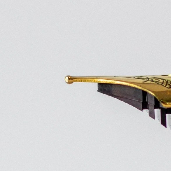
Sailor Pro Gear Slim (Yoseka) with an unaltered (aka “factory grind”) Medium (M) Nib
Regular/"Factory Grind” Nibs
Depending on where you are in your fountain pen journey, you may or may not know much of this information so feel free to skip ahead for pictures instead of redundancy!
The down’n’dirty: Any given fountain pen has a nib, and that nib comes in a multitude of different tipping sizes, and the size of that tipping corresponds to the line width that the pen puts down. (There’s a bit more to it than that, but I’m not trying to get xxxtra complicated here, as I discussed this in my Beginner’s Guide to Fountain Pens). The common sizes are Extra Fine (EF), Fine (F), Medium (M), Medium Fine (MF)(not as common), and Bold (B).
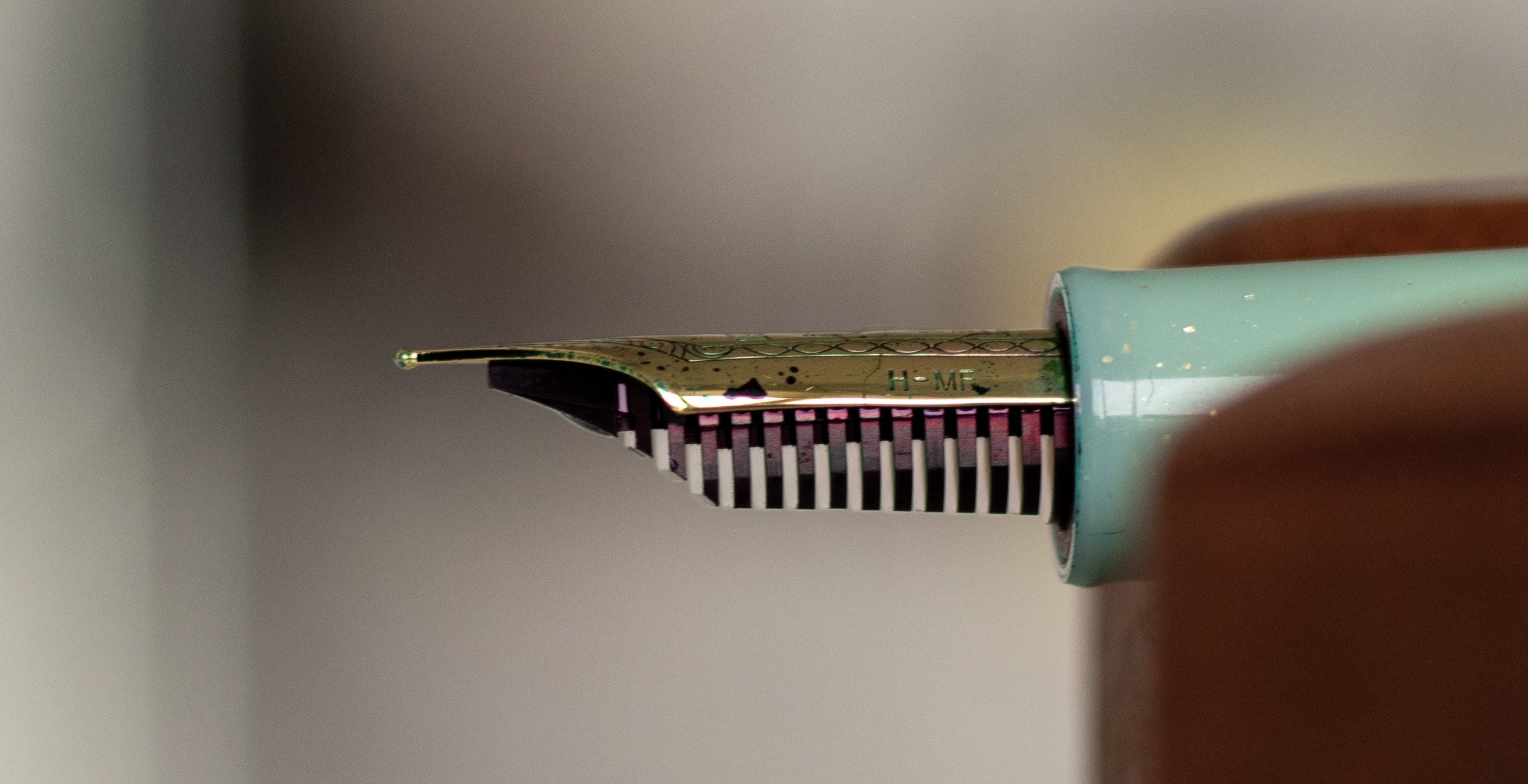
This tipping is rounded - basically a little ball of material at the end of the nib and that is what makes the writing feel so smooth (assuming that the craftsmanship is well done). Hopefully you can see what I’m talking about in the picture provided above, as well as these two photos:
When you purchase a fountain pen, it almost always arrives with a “factory grind” - meaning that your nib has been mass produced in whatever size you’ve ordered and has had no modifications. This isn’t a bad thing, and in fact, if the quality control (QC) is legit, then it’s actually great because that means you always know what you’re going to get - consistency in the product, hurray!
Architect Grinds
There are multiple different kinds of modifications one can make to their “factory” nib, however. Some people make these modifications themselves for various reasons, but it does take time, experimentation, and tools to get good at grinding nibs. If you don’t have any the time, tools, or desire to learn this skill, then you can send your lil’ pen off on an adventure to a professional nib grinder (sometimes referred to as nibsmiths or nibmeisters). The last section of my Resources page has a list & links to nib grinders I’ve used and would recommend.
Both Pen Realm and the Nib Grinder have cool visual guides on the different kinds of grinds that are out there.
For our purposes, I’m just focusing on the “architect grind.”
What is an architect grind?
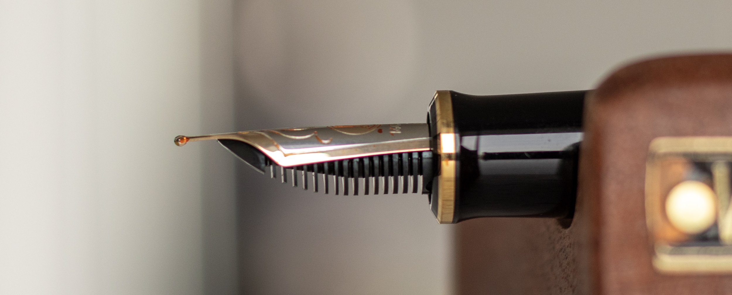
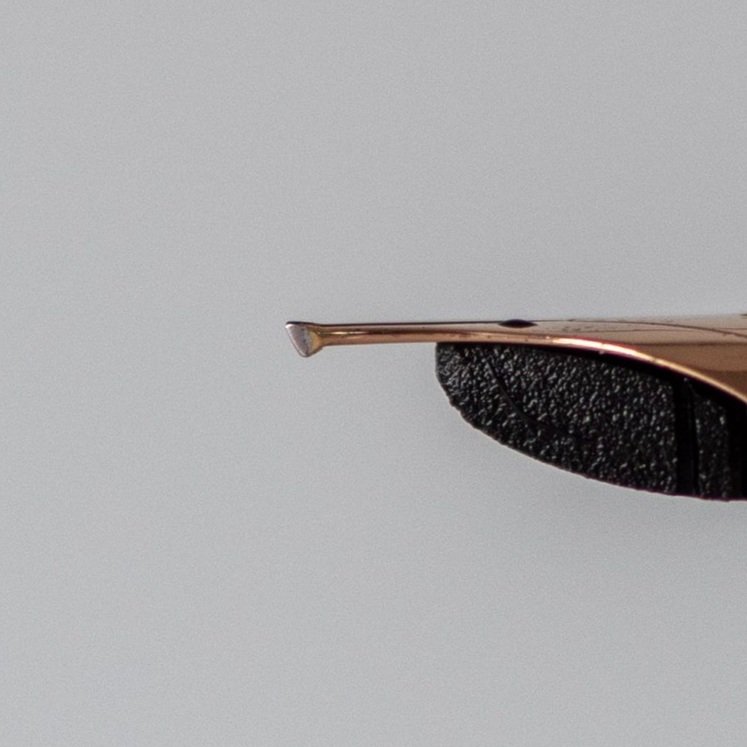
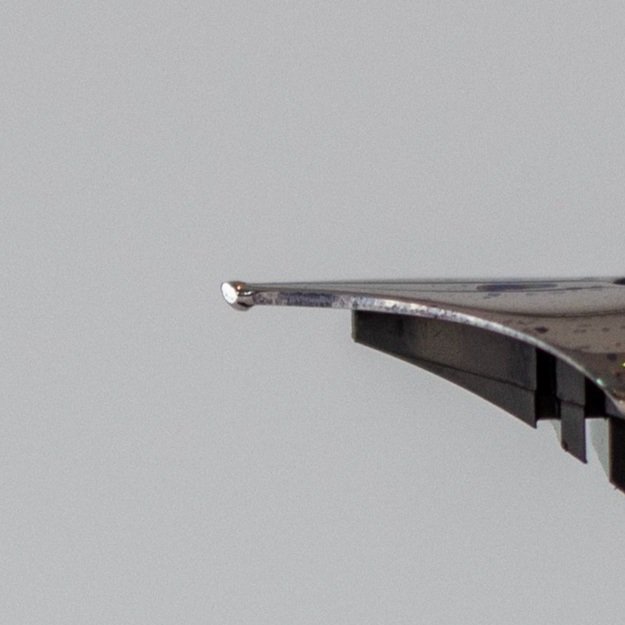
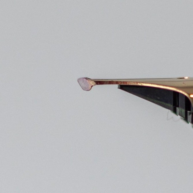
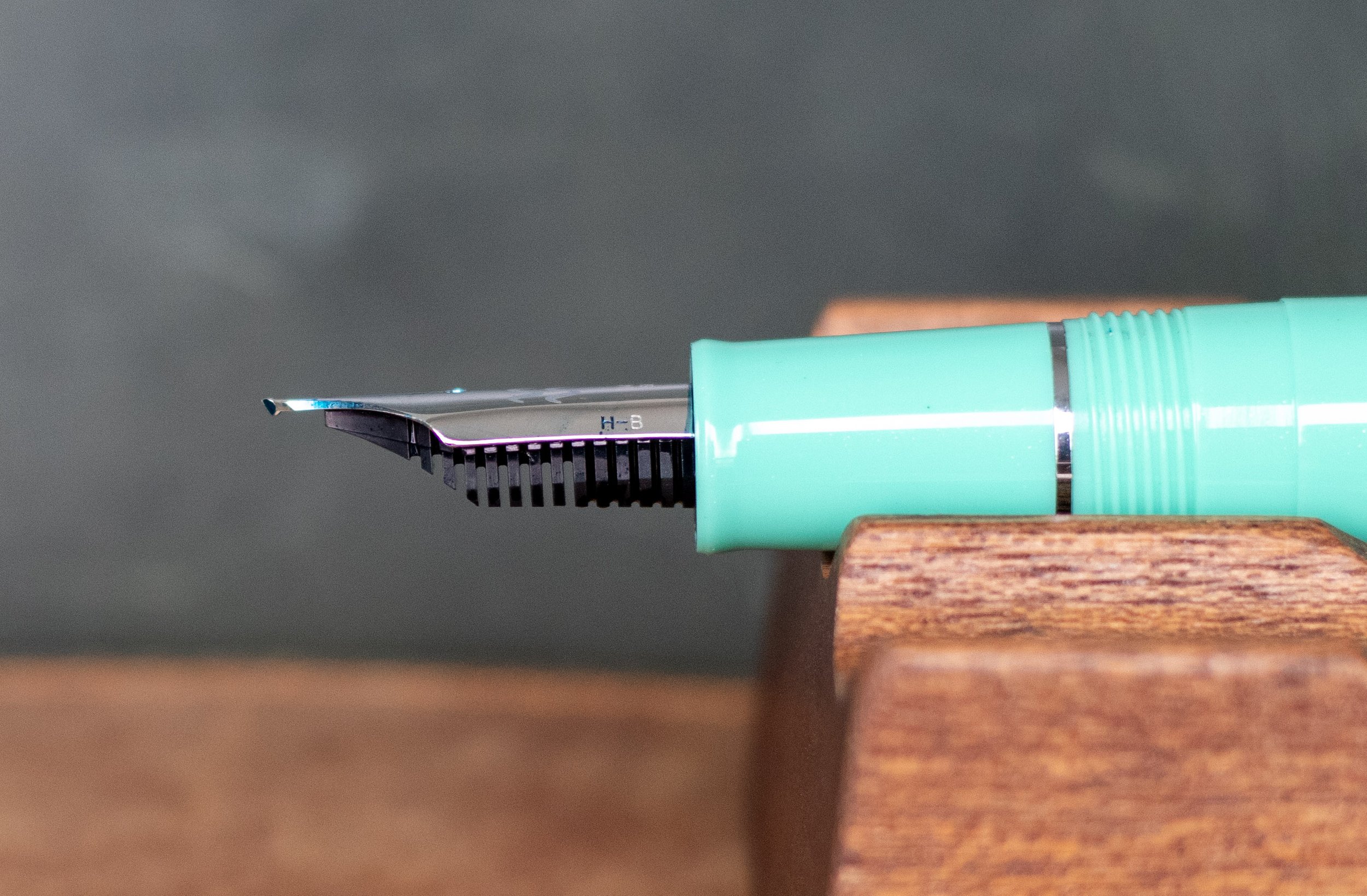
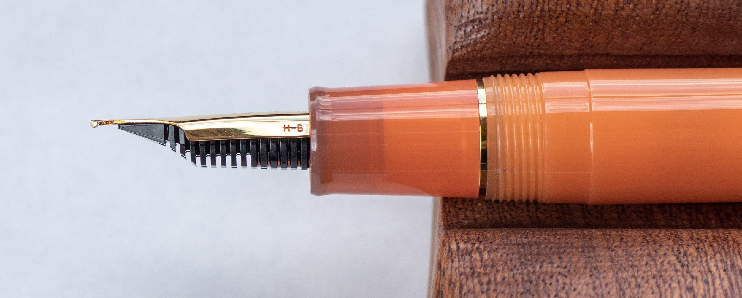
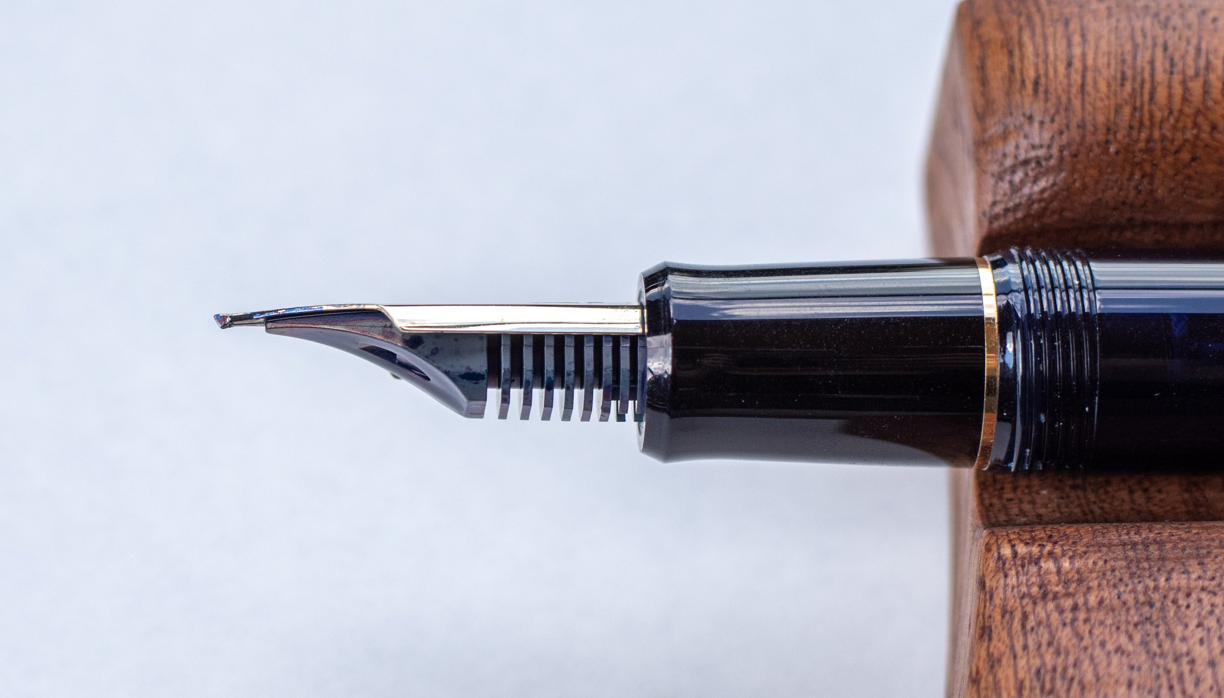
For any specialty grind, you essentially take the ball of tipping on the end of the nib and re-shape it. For an architect, this means shaping it so that it creates a thinner down-stroke than it does the cross-stroke.
This kind of a grind is great for block lettering and writing Hebrew/Arabic text because of the nature of those written alphabets.
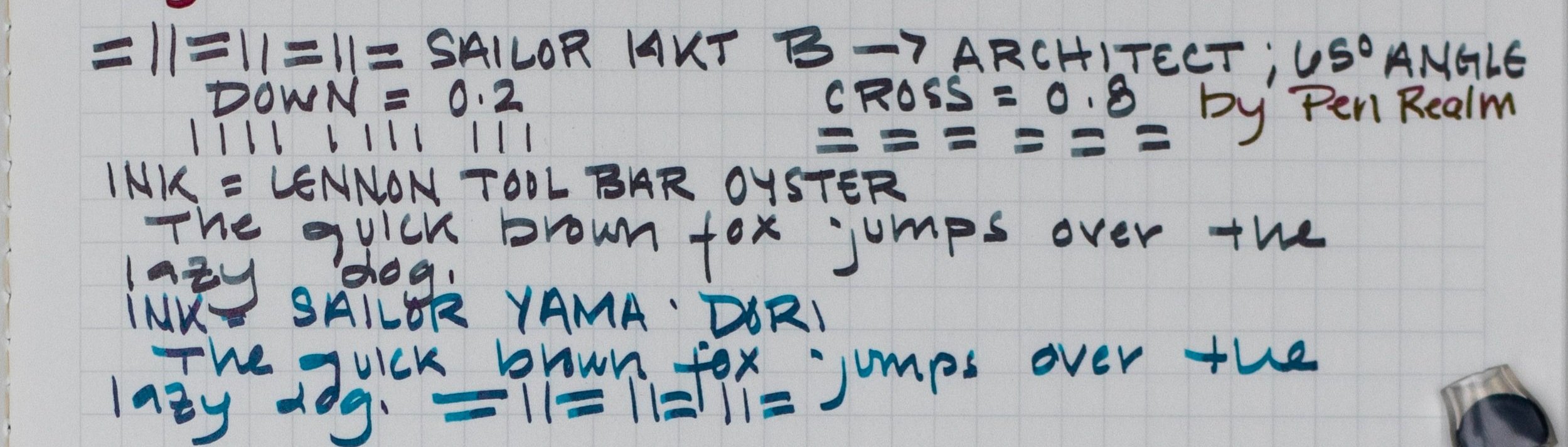
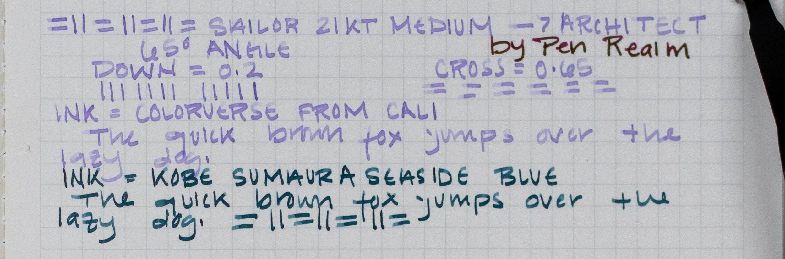
Take a look at the picture below to get an idea of what I’m talking about.

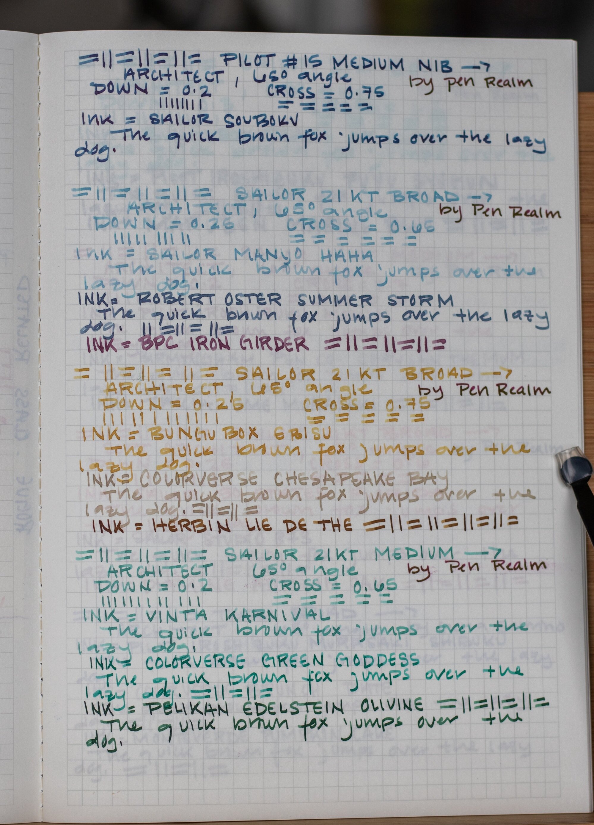
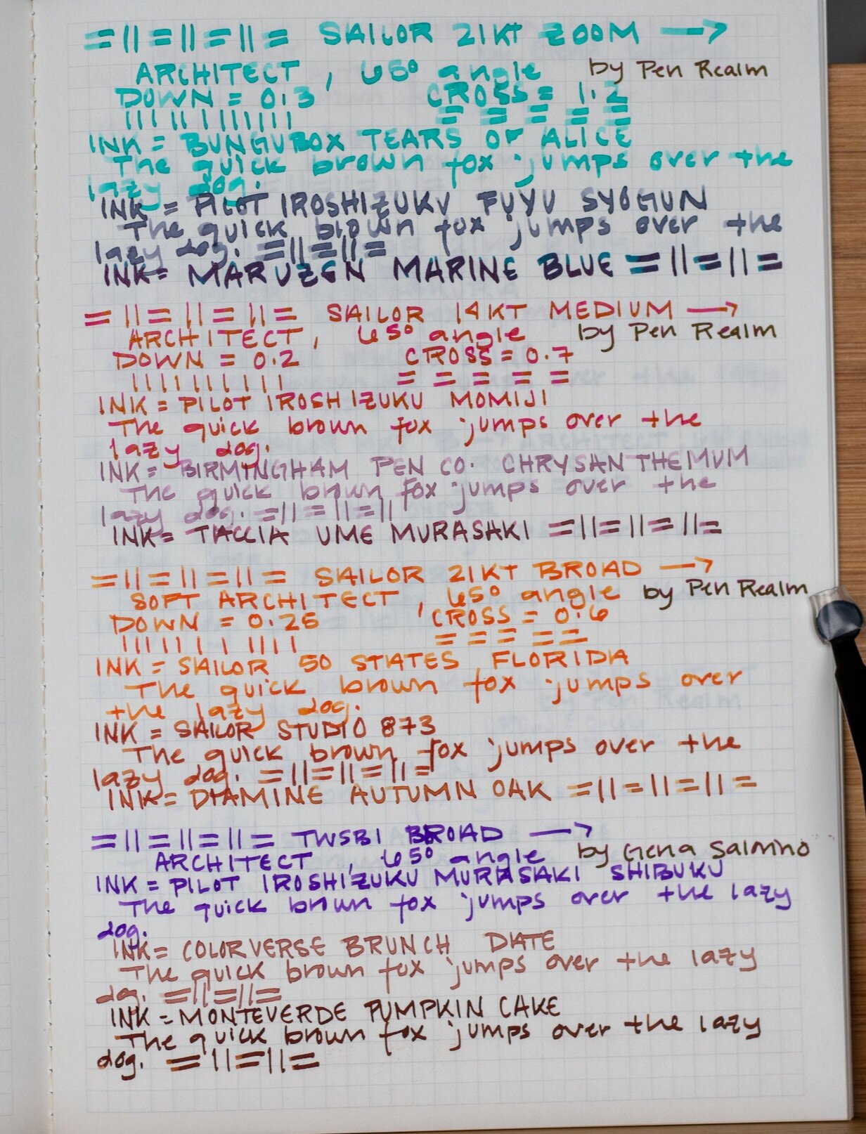
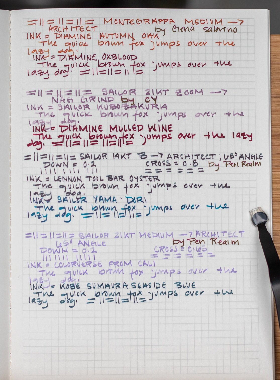
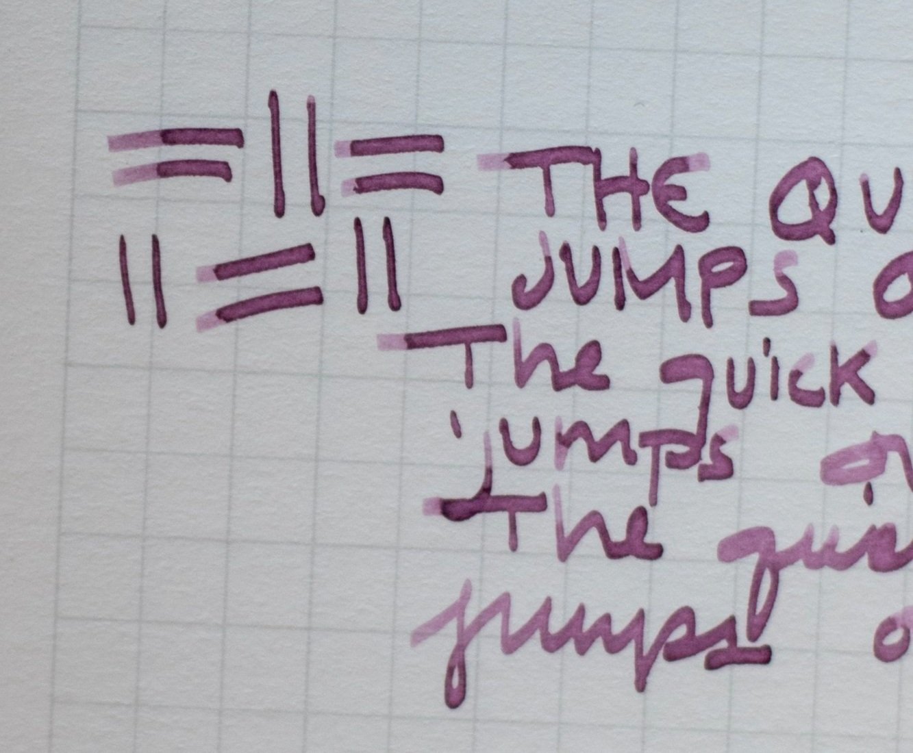
Zoomed in image of writing sample demonstrating the thinner down stroke (Down = 0.3mm) width & wider cross stroke (Cross = 1.2mm) width of a Sailor 21k nib. Used different inks to demonstrate how the ink properties show through with a grind like this.

The side profile of the architect grind on the nib that made the writing sample above.
Why I Use Architect Grinds:
An ~ Unintentionally Long ~ Story
Folks, I gotta tell you, I’ve tried out so many pens with different nibs - different nib materials, different sizes (both of actual nib size and tipping size - different things!), and different grinds - and yet I still could not claim to have tried out more than even the tiniest fraction of what is out there.
Anyway, throughout my trials and tribulations (shout out to Schmigadoon here), the one thing that I always wanted the most was for my handwriting to look its best. Now, to be fair to my hands, there is only so much difference a nib/grind can make. Of course the other part is working at changing your handwriting to what you want and then practice, practice, practice.
That being said, my first foray into unique nib grinds was the “journaler nib”. I thought it would be the perfect in-between to test out what it might do to my handwriting.
When it arrived, I was fascinated at first and thought with enough work I would have *gorgeous* calligraphy!!! Except…I really didn’t want to work that much at it and cursive is a bit of a chore to me. I realized that with my normal handwriting (print), the journaler nib actually made me hate my handwriting MORE. To be clear this is NOT about the quality of the grind - it simply wasn’t working with my handwriting style.
So, my next step - order an architect grind. Essentially the EXACT OPPOSITE of the stub (journaler). I ended up going to Pen Realm’s website and ordering a stock JOWO nib and requesting it to be ground to an architect point. I did it this way because the JOWO nib is what the Esterbrook Estie’s come with and they have easily interchangeable housing units - meaning I could simply just screw off the nib that came with the pen and screw in the new one, keeping both nib units in perfect working order and not permanently altering my pen. The JOWO I ordered was a steel nib and as such was much cheaper than a gold nib - so all in all, I went for my most cost effective & safest option.
I really, really enjoyed my first experience with the architect, and the more I used it, the more I felt comfortable with it and my handwriting sort of morphed around the nib grind. It wasn’t overnight, but from the get-go it was a more comfortable experience for me and the way that I write, and eventually (though the process is ongoing) my print started looking better (or, in my eyes, at least). The thin down strokes and wide cross strokes were forgiving with my sort of blocky handwriting and they made “messy” look cool.
So as they say, the rest is history! I went down a rabbit hole of sending three pens at a time to Kirk Speer @ Pen Realm and getting different sizes of architect nibs on most of my pens.

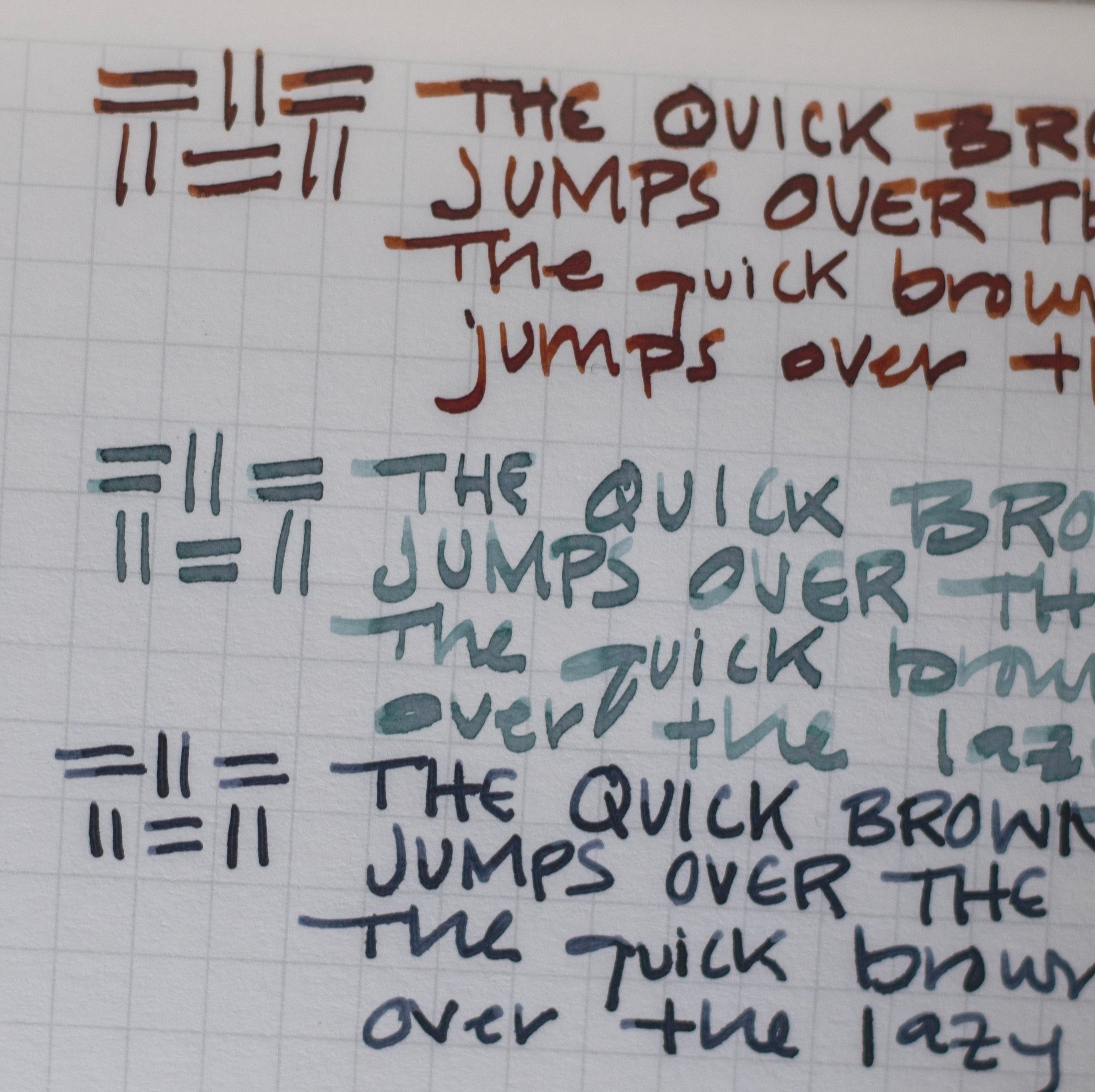
Pen: Leonardo Momento Zero MOP - started as a Medium Nib, sent to Pen Realm for architect-tification. Down stroke is now 0.25mm, cross stroke is 0.7mm.
Capital writing, lower case, then cursive to show the differences.
As a fair warning - having someone else grind your pens turns out to be pretty costly. For me, I found that I wasn’t enjoying actually using many of my pens if they weren’t ground to an architect point. I could tell this by the fact that I just didn’t reach for them as much as the pens that I had gotten ground, and when I did I found I was forcing myself to do so, so that they wouldn’t be “wasted.” My solution for this was to get the majority of my pens ground and in typical me fashion, I don’t do anything in moderation (for better or worse! eek).
Note - Paper used in all pictures in this post is Graphilo unless noted otherwise.
The Nitty Gritty of the Grind
If you have your eye on a pen but you think you might want it ground to an architect, PAUSE before pulling the trigger. The architect grind does best with larger tipping sizes (usually at least a Medium - M, but all the way up to Double Broads - BB, and Zoom - Z nibs). This is because the larger the tipping size, the more the nib grinder has to work with, and they can maximize the proportions of the thin down stroke and wide cross stroke - giving you great line variation, which is the fancy term to describe the effect of a larger difference between the down and cross stroke.
The bigger the difference, the more obvious it will show up in your handwriting, and then also change the way the ink you have in the pen displays on paper.
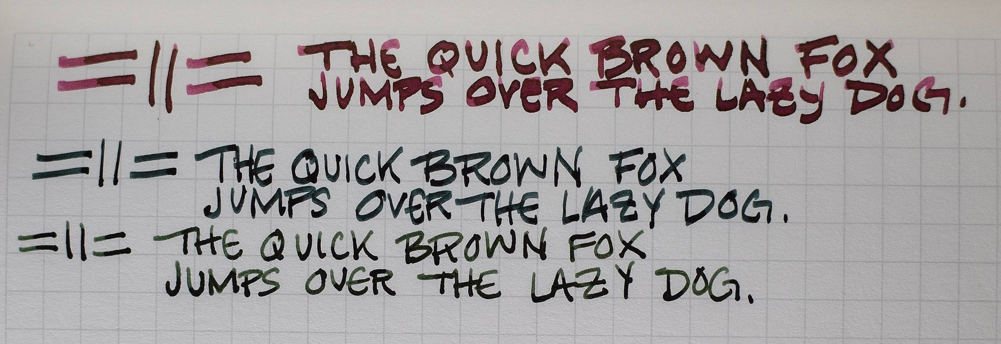
In the three pictures I’ve included above, I wrote with many of my architect grinds and detailed their down stroke and cross stroke widths, as well as tried to use multiple different inks in the same pens so that you can get an idea of how things change between widths and inks!!
Whenever I buy a pen now, I debate between a Medium or a Broad for the most part but sometimes get a little crazy with a Zoom nib or a BB - which makes for VERY fun nibs to write with, though a little less practical depending on what you use your pens for.
Angles
You can see in the above pictures how the tipping is not round like the factory grinds, but is kind of long and sharper-looking.
Oftentimes, it is because of this sharpish angle that the architect grind gets labeled as “unfriendly” for beginner fountain pen users and is even avoided by experienced users because it can feel scratchy unless you know exactly how you hold all of your pens (and sometimes even that doesn’t help but read on for a solution!).
In my opinion, this is only partly true.
The angle at which you hold your pen to the paper does matter because that is how you get the most accurate and obvious line variation from the pen.
Imagine the architect nibs shown above being held perpendicular, aka 90 degrees, on a piece of paper. You would only get the very tip of the pen writing on the surface of the paper - that tip now being ground to a very small point, versus the ball of tipping in an unaltered pen. You would get little to no line variation and it would not be a very smooth experience. Lower the pen to a less extreme angle from the paper, however, and you can see how it fits to the paper in a wide stroke. For me, I write at about a 65 degree angle from the page, and so that is the angle I ask my pen grinds to be adjusted at.
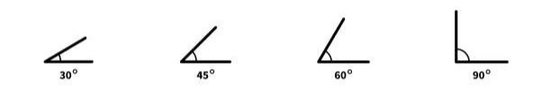
A little guide to help visualize the angle at which you hold your pen to paper.
As I’m sure you can imagine there are many different ways people hold their pens and that changes the angle of the nib from the paper and thus affects how their handwriting appears. Knowing the angle you hold your pen to the paper is a helpful and important part of ordering a nib grind like this!
Additionally, the width disparity between your down stroke and cross stroke is often referred to as “crisp” or “soft.”
Crisp being a much thinner down stroke and quite a wide cross stroke, giving you lots of line variation and making the architect grind the most obvious in your writing.
Soft being a much smaller difference between your down stroke and cross stroke, leading to less line variation but still a bit of flair in your writing.
The “softer” the architect, the easier it is to write with because the angle matters less and the edges aren’t as sharp.
However, after having tried multiple different architect grinds by different professional nib grinders, I have found that all of my architect grinds from Kirk Speer at Pen Realm are smooth - even the “crispiest” ones don’t give me trouble if I am not writing at exactly a 65 degree angle and they don’t rip up or catch on small paper fibers. They never feel sharp or scratchy.
I recently had the opportunity to meet Kirk at the Detroit Pen Show and talked with him about this, and he told me that he thinks the issue of scratchiness with an architect grind isn’t a level of skill issue, but a finishing one. Meaning, the angle and the grind itself are good - but unfinished - causing the scratchy feeling to occur. I’m not an expert, but what he said made sense to me.
Regardless of the why, though, I know that I’ll be getting my architect grinds from him moving forward because I’ve not had one single one disappoint!
NOTE - nothing written here is an ad, nor was I paid by anyone or given anything to review. These are all my own personal opinions, and as such, are subjective. As I’ve mentioned before, the best thing about fountain pens is that everyone can get what they want from it and those things can be vastly different depending on the person.
Middle Earth Rating: All Races
Ok this is a bit of a cheat but…I think this kind of grind would be great for all the languages that Tolkien developed. As I mentioned before, this grind does well with Hebrew and Arabic texts and Tolkien’s written alphabets/runes are strongly reminiscent of both of those in looks (not necessarily derived from phonetically or philologically - that is a web that I do not have time to untangle here).
I just think this grind looks great with everything - different forms of Elvish, Dwarvish (Khuzdul), Mannish (Common), Orkish, Black Speech - I mean, really whatever.